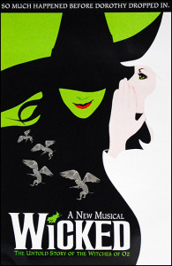
 This is not just one of my favorite broadway shows, but one of my favorite posters. The aesthetic of Elphaba the bad witch and Glinda the good witch fitting together to create one image shows the idea of how these characters were once allies. The contrast in black and white counteracts this though and shows the good and bad characters, white being good and black being bad. Also, the big title and not much other text doesn’t overwhelm the viewer. The text font used for the title, being almost a gothic design, represents the eeriness of the play and mirrors the actual word “wicked.” There is not too much color so you are not overwhelmed, and the way the negative space reflects the green in Elphaba’s face is very cohesive. Overall, this simple but thought out poster truly reflects the aesthetics of the play.
GRA 217 Section 5 Group 1
The official blog for GRA 217 with Sherri Taylor


I really like this poster as well. Not only are the colors appealing together, they symbolize the characters. Glinda the “good” witch is dressed in white, which expresses innocence and purity. In contrast, Elphaba, the “bad” witch, is dressed in black. The contrast between the colors works well, and the poster looks visually appealing because there are only three main colors (white, black and green). The poster also looks balanced because the green background matches Elphaba’s skin color and the white “Wicked” wordmark matched Glinda’s dress. The wordmark mirrors the word “Wicked” well because of the unique letters, which look crooked and spooky. The green witch serving as the dot over the “i” adds extra visual appeal, and the gray flying monkeys fill what would otherwise be too much black space.
Besides The Phantom of the Opera, Wicked always remains one of my favorite broadway shows. The combination of bad and white is very harmonious and represent different characters in the musical. The design of gray flying monkeys around the bad witch didn’t only fill the big black space also fits the original story that these monkeys are the creatures aiding the bad witch. I also like the green witch as one of the part of the title. It’s very vivid.