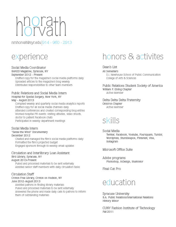
Nora’s wordmark immediately caught my eye. It’s very creative and playful, yet professional. Her color choice of light teal and grey creates an awesome contrast throughout her headers as well. My main suggestion is to perhaps try different weights for her experience section. I think it would create more visual hierarchy. And I know everything is lined up, but the tabs play a trick on the eye–it looks like the columns aren’t exactly aligned. This could probably be solved by adding bullets or larger tabs.


Nora’s wordmark immediately caught my eye. It’s very creative and playful, yet professional. Her color choice of light teal and grey creates an awesome contrast throughout her headers as well. My main suggestion is to perhaps try different weights for her experience section. I think it would create more visual hierarchy. And I know everything is lined up, but the tabs play a trick on the eye–it looks like the columns aren’t exactly aligned. This could probably be solved by adding bullets or larger tabs.