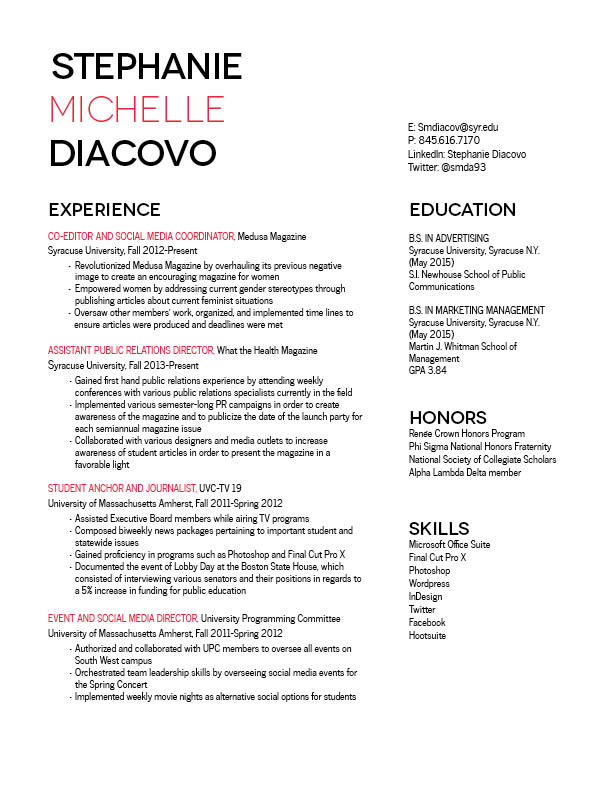
By having your wordmark be so big, you actually created a lot of white space at the top of the page. Your resume certainly has a lot of content on it but I don’t look at it and get overwhelmed or confused. You somehow managed to make a completely full page look empty (in a good way!). I also think that you incorporated your wordmark into the page very cleanly. Because your job titles are in pink they not only stand out but my eye is able to easily flow from your wordmark to your “Experience” section.
This resume is balanced very nicely. The white space on the page created by the large wordmark and the spaces between sections ensure that all of the information doesn’t look overwhelming. Every section is separated well because of the large headers, which match the wordmark exactly. The separate entries under “experience” also stand out because of the pink color, which ties into the wordmark as well. I also like how you separated your two different majors in the “education” section, but feel as if your GPA should be separated, too. My only suggestion is see how the resume looks if you line up the bottoms of both columns to make them an even length.