
I really like how typography is applied to this picture.
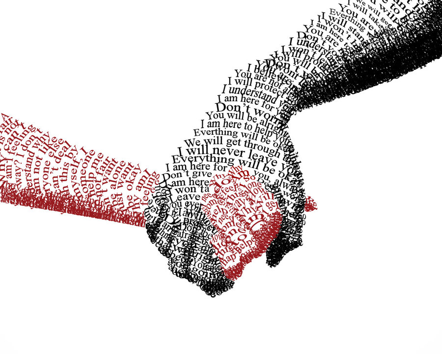
The sentences “You are alright, I am here to help you…” consists of the black hand, which holding the red hand. These comforting sentences give people a reliable feeling and the solid black appear grave and composed. It makes people feel safe when seeing that black hand.
The phrases and words “alone”, ”by my self”, “why people…” formed the red hand, which is held by the black one. These sensitive and incomplete phrases imply loneliness and a desire to be cared and loved. The red shows emergency, highlighting the desire to be cared. The contrast of black and red imply the big difference of two hands. With these two hands holding together, though the picture just simply uses typography, it strongly conveys designer’s ideas.


I was very drawn to this typography design. I think the shadowing done using tight text is really incredible. I also really like that contrast was created between the two hands using color and different words. I think this is a great example of text being used to not only tell meaning with words, but show it through a picture.