
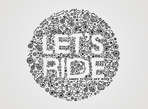
I love that this designer thought to use negative space to form the type. The doodle-like illustrations surrounding the letters give it a playful, childlike feel. Riding your bike has an element of a youthful mentality, and I think this typography executes that very well with the illustrations of children. It’s hard to notice at first, but there’s phrases like, “I want to ride my bike” and “Ride Bike” in small serif type. It’s interesting that the designer included type within the typography, but it works because there’s a contrast between the white and black.


The negative space applied in the picture is a very smart idea. Like what you said, though the designer also use type, the combination of type within the typography is very well applied. I love how the designer uses the white space. It makes the whole picture look clean and organized.