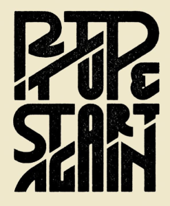
The intricate design on this “Rip It Up and Start Again” poster relies entirely on typography. Many of the letters have double functions and work in two separate words. For example, the “P” works in both “rip” and “up” and the “A” works in both “start and again” Similarly, bottom stroke of the “I” in “rip” doubles at the top stroke of the “T” in “it.” The double functions work because of the way the words are strategically stacked on each other. Instead of being confusing, though, the design is effective because of the white space and kerning. People can tell that the “P” works with “rip” because it is attached to the “I,” but it also works with “up” because of the tight kerning between the “U” and the “P” and the fact that the bottoms of the two letters line up. I also find it interesting how the letters are different sizes and shapes in order to fit together nicely. The white space also clearly separates the words and provides balance, order and a “clean” look. However, the connections between the letters and tight leading and kerning bring the entire design together.
GRA 217 Section 5 Group 1
The official blog for GRA 217 with Sherri Taylor


