
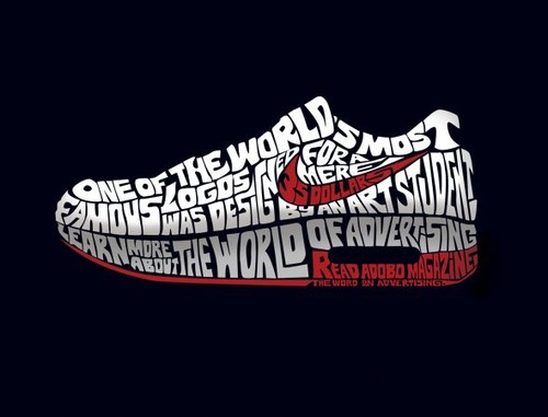
I thought this advertisement for Nike and Adobo Magazine was really cool. The typography in the advertisement is designed to look like a Nike sneaker with the famous Nike swoosh on the side. The shoe reads “One of the world’s most famous logos was designed for a mere 35 dollars by an art student. Learn more about the World of Advertising. Read Adobo Magazine.” Nowhere in the advertisement does it say anything about Nike, however, you can just tell by the swoosh and the statement regarding “the world’s most famous logos.” Also, the space between “the World of Advertising” and “Read Adobo Magazine” suggests that the sneaker is of the Nike Air type. The typeface used is in all caps and morphed so that the type fits the figure of a Nike sneaker.


I think this is a really great example of typography design. The words tell a story, but the image is what completes the message. Before even reading the text I knew that the image was of a Nike shoe. I find it very interesting that the designer decided not to actually use the word Nike in the design, but rather show the famous logo. Although the typeface is morphed to create the image it is still easy to read because of the color, all caps, and size of the typeface.