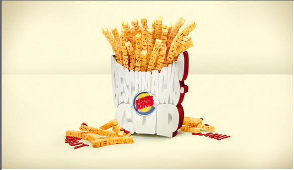
This typographical deign of an order of fires from burger king uses a clever set of bold all caps typeface to represent the popular side order. The typeface is big and fun, just like an order of fries at burger king. However, the design is not spectacular because it is quite difficult to read what the fries are saying. This makes it difficult to interpret exactly how the order of fries is meant to appear. This is actually a fairly major flaw in the design because it interferes with our understanding of the poster. While the idea is clever, the poster itself simply does not work.


I agree with your argument. While it seems Burger King is trying to apply the idea of good typography in the poster, it doesn’t work very well. The bright yellow makes the typography difficult to read. But it’s still a very smart idea though hard to read. The poster itself is somehow still very fun.
At first glance, this image is very appealing and catches my eye, however, as you said, once you look closely at it you cannot understand the typography at all. In my opinion this kind of defeats the purpose of this design. Nonetheless, The fries still look appetizing and make me want to go to burger king and order some. Therefore, this ad or image is not a complete failure.