
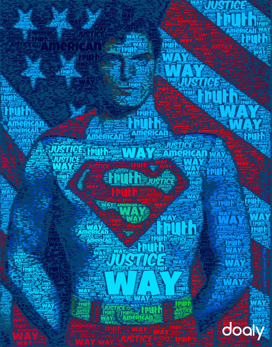
I really enjoy this poster because it uses the same words (truth, way, justice, American) to make a picture of Superman in front of the American Flag. This image both brings out the child in everyone and their patriotic beliefs. In no way whatsoever does the words ever describe what the image actually is, just what it stands for. Furthermore, the colors themselves instantly attract the eye right to Superman’s chest where is classic S insignia lies.
This image is creative in the fact that it is simply made from words in different text colors. When someone sees this poster, he or she instantly wishes it was them in front of the flag.


This poster is patriotic as much as it is clever. The wide range of not only typefaces but categories of type effectively creates the image of Superman standing proudly before the American flag. You bring up a good point by noticing that the words do not actually describe the image but instead what the image represents. Also the waves of color create a three dimensional effect. Most of the type appears to be of the novelty category, which is effective in this particular use. The type is fun and comical (pardon the pun) but the picture is proud and strong. An interesting combination.