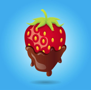
This strawberry would be very easy to make in illustrator by mainly utilizing the pen tool. First, I would create an ellipsis then drag down the bottom anchor point to create a more strawberry-esque shape. Then I would drag down the top anchor point to flatten the top. Then I would fill the shape with a red color. To make the seeds, I would create a smaller ellipsis then copy and paste the shape all over the strawberry. Then I would have to select portions of the strawberry to adjust the gradient to create the shadow that it has. In addition, I would use the pencil tool to draw the shape of the chocolate dripping off of the strawberry. Then using the ellipsis shape tool I could drag the anchor points to create the stem/leaves of the strawberry. Afterwards, I would use the pen tool to draw the shape for the stem of the strawberry.


I like how you picked this image because at first its seems like a rather simple image to make in illustrator. However, after looking at it for a little bit, I realized how much detail there actually is. You’re right the outline of the strawberry itself would not be complicated to make. However, I’m kind of curious to how the shadow would be made. It looks as if it is a completely different color than the rest of the strawberry. I feel like you could not simply adjust the gradient to obtain the shadow on the strawberry. It looks as if the artist created a new shape completely and laid it over the strawberry.
Although this visual looks fairly simple at first sight, once you analyze it there is actually a lot of detail which would make it pretty tedious to create on illustrator. More specifically, the artist manage to make the strawberry look like it has some dimension rather than flat. This is because of the shadowing technique that he/she used, which in my opinion is a very intricate process.
I like how simple this picture would be to make but it doesn’t look very basic. The lighter parts on the strawberry and the chocolate make it look three dimensional but are really just drawn with the pen tool and are completely flat. The white cloud behind the strawberry also adds a lot to it but that’s completely easy to do with a few effects added to a circle drawn by the shape tool. The really bright colors add a lot too and that’s something that’s completely easy to do. And I mean hey, it’s a chocolate covered strawberry, who doesn’t like those.
I love the point about using the gradient tool to give the image a three dimensional look. Also, the idea of creating a single image and then copy-and-pasting it is great. That concept can in some way be applied to almost any of the pictures that people have been posting, and be used to make it much easier to create them. Your explanation of the construction of the stem/top of the strawberry was very helpful. When I first looked at this image, I thought that it would be tricky to produce that exact look, but you outlined it very well.
I love your choice of this image. It looks very simple but actually, it uses the illustrator very well. The chocolate cream and the green grass on the strawberry will cost the designer tons of time to finish the vivid image. And the shadow on the strawberry and under the strawberry seed is also very hard to create in order to work for the image itself. Really like your analysis on how to use the illustrator.