
Coming into the class I did not have more than an elementary knowledge of graphic design and the softwares involved. After learning about the powerful ways in which the principles of design affect all aspects of life, I now recognize the value and worth in being able to manipulate public perception through the use of design tools and techniques. Prior to this class, I did not analyze and understand graphic design in the same way that I do now as I now am able to make the best use out of design principles and tools such as kerning and leading. Also, I now blame this class for how I will never be able to look at text the same way–now type is more than type. Now I find myself looking at typefaces and am able to recognize whether it is a serif, sans-serif, or another possible typeface. Counters, kerning, x-heights, margins, the rule of thirds, complimentary and analogous colors–forever stuck in my head thanks to this class!
Author Archives: Julie Gelb
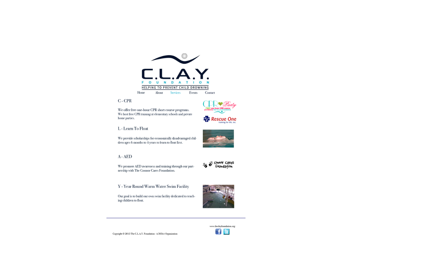
The C.L.A.Y. Foundation Website Design
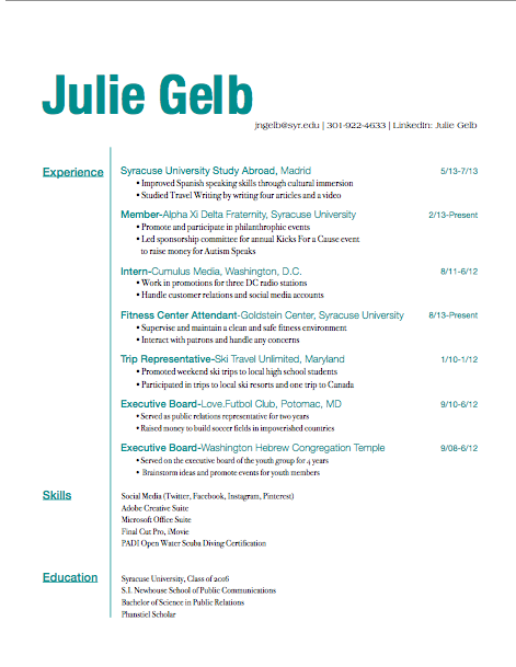
Resume
Kicks For A Cause
Chobani Go Real Website
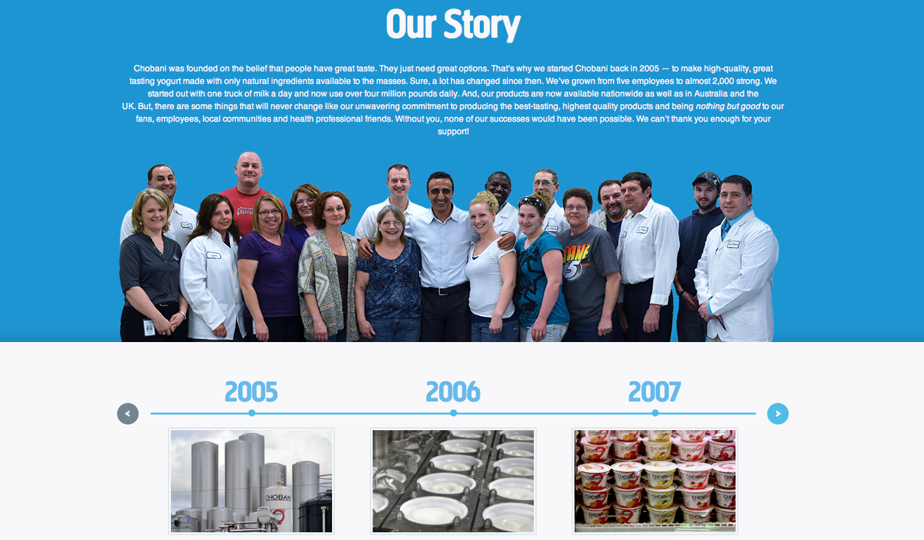
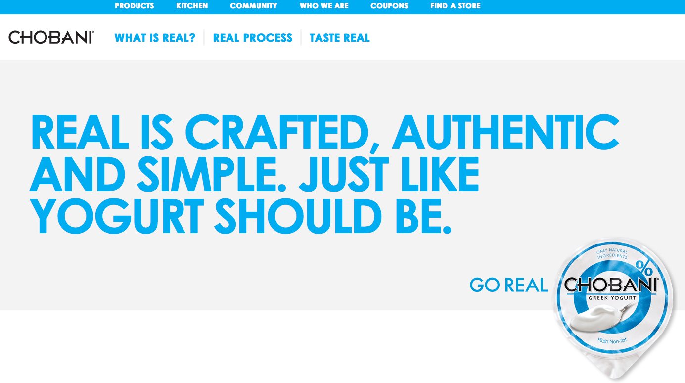 On the Chobani website’s home page, the design is clean and simple while maintaining a bold edge. Emphasizing the white space, the page is dominated by a specific blue color and white as it creates continuity of the colors of their plain original yogurt. Next to the Chobani wordmark there are three headings: “What is real?” “Real Process” and “Tastes Real.” By clicking on each of these tabs, it automatically scrolls you down to a further down section of the page.
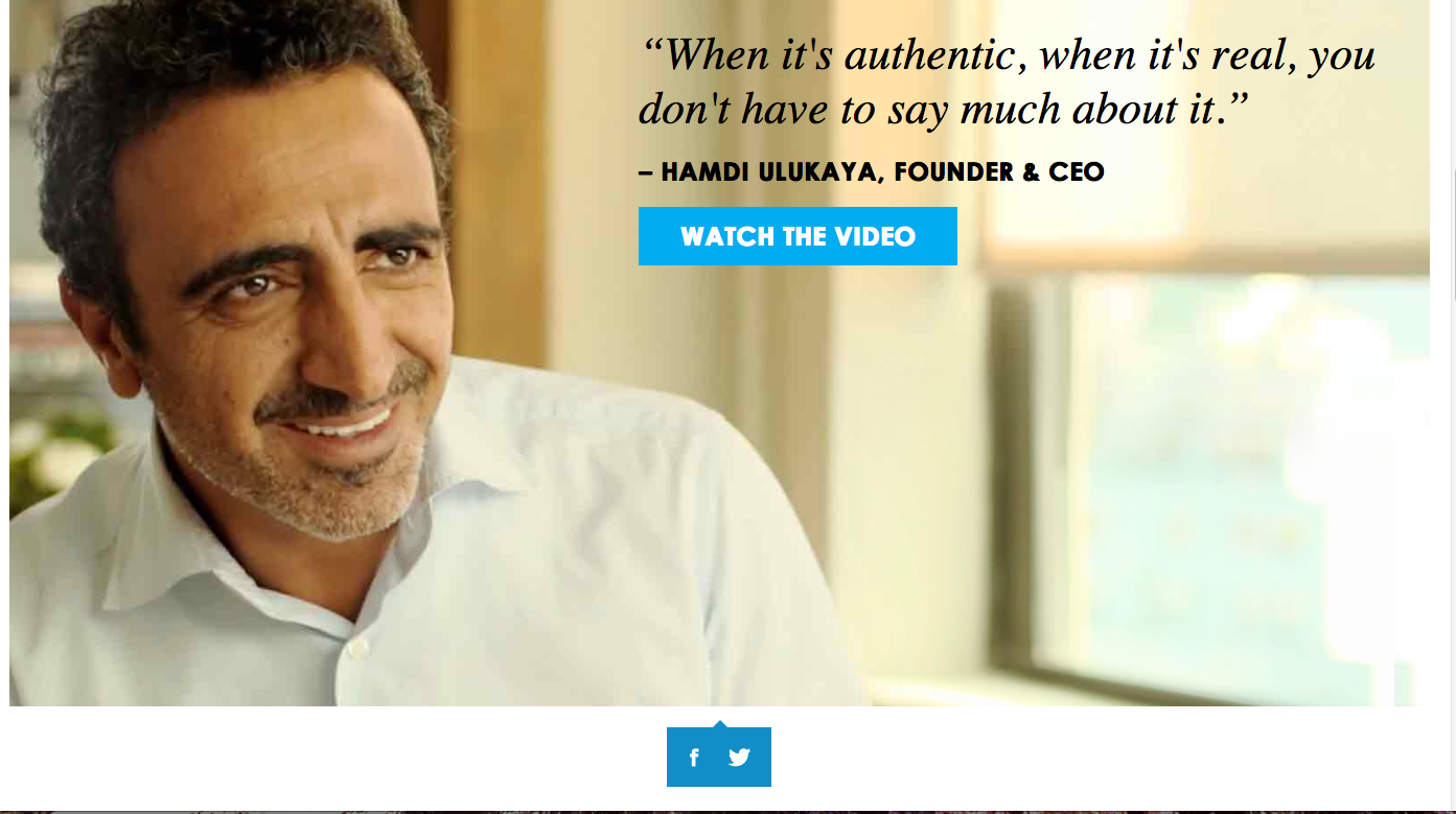
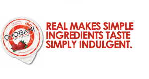 “What is real?”
In the words of the Chobani founder and CEO, customers are offered to watch a video which can then be linked to either Facebook or Twitter as indicated by the two icons under the video–an easy way for customers to show their support through social media.
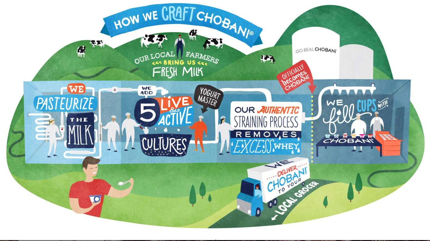 “Real Process”
I really was drawn to this cute and colorful depiction of the process Chobani uses in producing their top-quality yogurt products. With a variety of different typographic styles and techniques, it all works together to create an interesting and captivating picture that is meanwhile informative.
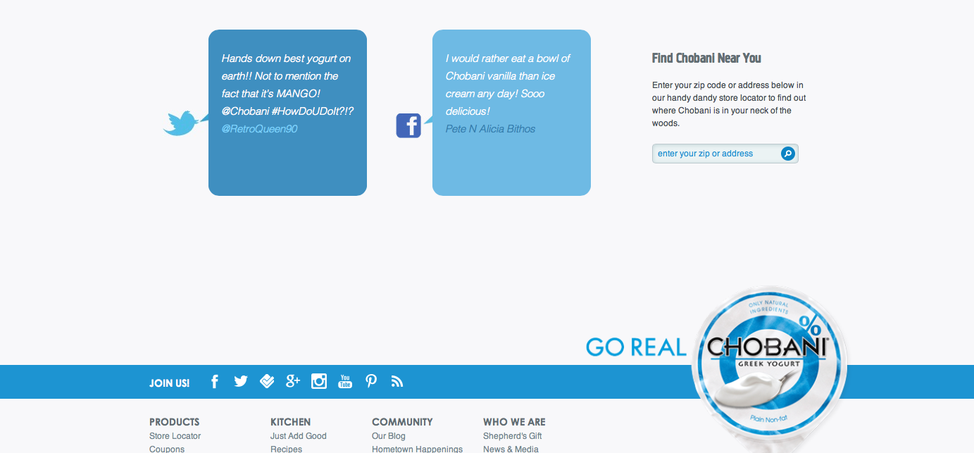 At the bottom of the page, cartoon speech bubbles show the words of real live customers that are either tweeting or facebooking about Chobani which informs viewers of other opinions as well as encourages them to share their own experiences through social media. I also really like the continuation of the color scheme as it focuses as well as emphasizes the yogurt on the bottom right which is in line with a rectangle across the bottom with tools in which to share information. I think it flows together really nicely.
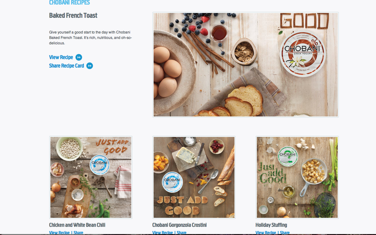 In accordance to their philosophy of natural and healthy eating, it makes sense that Chobani would go the extra mile to include a section of their website dedicated to health-conscious cooking recipes. The easy recipes that promote their own products encourages customers to not only eat healthy, but also to eat their healthy products.
 In the end, Chobani’s website is effectively designed to attract customers who are likely to fall in love with the company’s natural, health-conscious ways. I am drawn to their website as its simple, color block design and attention to detail creates a unique web layout to entice viewers.
Illustrator

This strawberry would be very easy to make in illustrator by mainly utilizing the pen tool. First, I would create an ellipsis then drag down the bottom anchor point to create a more strawberry-esque shape. Then I would drag down the top anchor point to flatten the top. Then I would fill the shape with a red color. To make the seeds, I would create a smaller ellipsis then copy and paste the shape all over the strawberry. Then I would have to select portions of the strawberry to adjust the gradient to create the shadow that it has. In addition, I would use the pencil tool to draw the shape of the chocolate dripping off of the strawberry. Then using the ellipsis shape tool I could drag the anchor points to create the stem/leaves of the strawberry. Afterwards, I would use the pen tool to draw the shape for the stem of the strawberry.
Week 3 Gelb
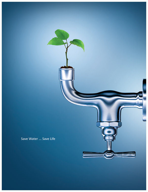 {Save Water…Save Life}
In this poster, the eco-friendly message is conveyed through its simple and clear design. Combining the natural element of the growing life of the budding seedling coming out of the faucet represents the need for the seed’s need for water and our need to conserve Earth’s limited fresh water supply in order to create a more sustainable future. The chrome of the faucet against the blue and white background is shiny, clean and even reflective–possibly of a more sustainable future? Portraying the give and take relationship between nature and modern technology, the poster’s design effectively raises awareness to remain conscious of our water usage and cognizant of our environmental impact. I like the way that the reader’s eyes are drawn first to the vibrant green leaves growing from the faucet which is turned upside down so as to not let any water escape which continues the theme of the poster.
Week 2 Gelb

As a popular platform for image sharing, Flickr uses Frutgier Black in their wordmark. I think that the boxy-shaped letters of the Sans-Serif typeface has a clean feel that makes it easy to read. I like the square dot over the letter “i” that maintains the square style of the letters. Also, it is important to note the stylistic choice that was made to use five blue letters and one pink letter at the end. By having the first five letters “flick’ in blue, it isolates those letters and emphasizes the word “flick” which in my head makes me think of how it sounds like “pic” which aligns with the company’s role as an image host site. Similarly, the single and last letter “r” is a deep magenta that leaves the eyes on a bright, enticing note. I like that the wordmark conveys just enough playfulness and curiosity, but without taking away from its sense of professionalism.

Similar to the font “Optima,” the Nordstrom wordmark is a custom typeface specifically designed for Nordstrom’s use only. With the slightest flares at the end of the letters, it has subtle yet classy and refined style that exudes Nordstrom’s branding as a respectable household name. In addition, I like the tiny variations in its weight and thickness as it easily leads the eyes across the evenly spaced and capital letters. The use of all capital letters exudes a sense of strength and pride in the company. The Nordstrom wordmark is classic and elegant. As an avid shopper and supporter of Nordstrom, I’ve always been able to count on Nordstrom for quality service and products–Nordstrom’s powerful logo is justified as Nordstrom stands apart from the rest (just like the letters through the use of kerning).