Gestalt Blog Post

gra 217 blog


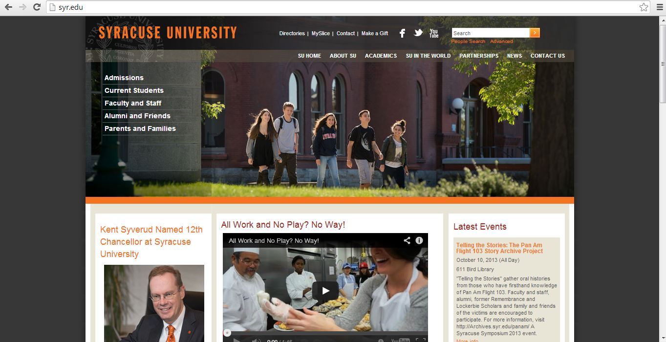
Our own Syracuse University website is a great example of the gestalt principle.  First, every important header on the website is the color orange, the school’s main color.  Second, all of the headers match in font type and the subtext under each header is consistent throughout the entire page.  Third, the constantly change picture at the top of the page takes up a large space in order to attract the attention of the viewer.  Lastly, the video link is placed in the center for interactive use with the viewer for the purpose of truly giving him or her a full perspective on Syracuse University.

Blog Post: Website

gra 217 blog


I truly enjoy this website for several reasons.  The rotating images from all their different product lines initially grabs the viewer’s attention.  Second, it uses images all throughout the entire page instead of words to depict their products in use.  It’s black background contrasts well with the red colors.  Overall, this is a well designed website that allows viewer’s to scroll through very easily.

Interaction is key

Screen shot 2013-10-03 at 4.11.55 PM Screen shot 2013-10-03 at 4.13.41 PM Screen shot 2013-10-03 at 4.13.22 PM


The reason that I chose this website was because even though it is in a different language, it easy really simple to navgate. I was initially drawn to the home page which contained a combination of moving visuals, pictures, and automatic videos. The baby in the bottom left of the home screen is actually in motion when you visit the site. Another aspect that I liked was the color scheme through out the entire website. The organization deals with children, and because of this I felt that the warm colors that were used were appropriate. One of my favorite things about the website overall was the way it allows you to interact with everything on the screen. The hexagons above all twist and reveal a bigger part of the image when you hover over them with your mouse. The website is very interactive and makes it fun to navigate through all of the pages because you never know what is going to happen next. Overall I feel as if this website gets the point across with easy to read type, encompasses a personality of its own, and keeps the viewer interested at all times.

Illustrator

chocoberry_33


This strawberry would be very easy to make in illustrator by mainly utilizing the pen tool. First, I would create an ellipsis then drag down the bottom anchor point to create a more strawberry-esque shape. Then I would drag down the top anchor point to flatten the top. Then I would fill the shape with a red color. To make the seeds, I would create a smaller ellipsis then copy and paste the shape all over the strawberry. Then I would have to select portions of the strawberry to adjust the gradient to create the shadow that it has. In addition, I would use the pencil tool to draw the shape of the chocolate dripping off of the strawberry. Then using the ellipsis shape tool I could drag the anchor points to create the stem/leaves of the strawberry. Afterwards, I would use the pen tool to draw the shape for the stem of the strawberry.

Illustrator

http://www.dreamstime.com/stock-photography-image32594052

This image would be fairly easy to complete in Illustrator. The woman’s face can be used with the pen tool and making curved vectors and making sure that it’s not exactly perfect so it comes out slightly abstract. These curved vectors can be used for all part of the face. Even the shadows on her face can be made with the pen tool. Her hair can be made with drawing curved lines. The color in her lips and eyes can be used with the paintbucket tool and the color in her hair along with the color in the back are all used with the pen tool and making vectors. The very background color could be made with the shape tool. The colors’ opacity has been altered and the vector shapes overlapped to get a more abstract look.


Adobe Illustrator

lgmp0163homer-simpson-doh-the-simpsons-mini-poster-1

This image was most likely done in Adobe Illustrator using primarily the pen, paint bucket, and text tool. The designer most likely used the shape tool to draw a rectangle for the background and then filled the shape in with blue using the color tool. The the designer probably used the text tool to write D’OH! in white. Having completed the backdrop the designer then probably used the pen tool to draw the outline of Homer and used the color tool to fill in the different sections of his face and upper body. The pen tool was also most likely used to create the details within the outline like his hair, eyes, shirt, etc. This image is simple yet conveys emotion very well and is a great representation of Homer Simpson.

Illustrator Drawing

image


What intrigues me about this image is it’s simplicity, but it’s ability to still send a concise and direct message. I can imagine that this image was made simply by tracing over an image of Darth Vader with paper and pencil and scanning it into Adone Illustrator. Then using the pen tool, the artist can easily draw over the image and add the additional details to Darth Vader’s face. Once the image is complete, it would simply be a matter of chanjng the pen’s color to grey and adding whatever text is needed at the bottom. The logo could simply be added by drawing it with the pen tool in a grey color scheme. With those simple tools, the image is completed and sends a clean, concise message.

Adobe Illustrator


gra 217 blog


This is a piece of art that was created in Adobe Illustrator.  From my perspective, I believe that this image was created with the pen tool.  It particularly catches my attention because the lines are not straight, but curved to give off the idea that this image was hand drawn.  Furthermore, the use of the black background makes the other three colors of the image pop to the viewer.  Overall, this image is extremely well done.

Adobe Illustrator

Screen Shot 2013-09-27 at 5.06.59 PM

This image of this snail was probably created using a variety of tools in Adobe Illustrator. The basic shapes, such as the orange snail body and the brown shell, were created with the pen tool, focusing on curved lines. The gradient tool was used for the orange fill, since the color is lighter on bottom and darker on top. The ellipse tool created the small yellow ovals on top of the snail, and possibly the larger half-ovals near the grass (these ellipses were just trimmed in half).  The pen tool was used for the orange part of the eyes, and the ellipse tool was probably used for the silver and blue part because the circles are nearly perfect. A blue gradient was used in the eyes, and light ovals created by the ellipse tool inside of the eyes create dimension and light. The pen tool was also used to create all of the small details (like on the snail’s shell and its mouth) and the paint tool was likely used to fill everything in. Since the snail was created with Illustrator, it looks imperfect. However, the imperfections make the image appealing.

Illustrator Tool

donut

This is a very easy picture to create in Adobe Illustrator CC. The Ellipse tool under the rectangle tool can be used to create the basic shape of the donut. The gradient tool can create the gradient brown color we see on the donut. Besides, the pen tool can help create the irregular shape of the cream on the donut. Then, again, the gradient tool will fill the gradient pink color on the donut. Pencil tool can be used to draw the sprinkles on the donut. Then, it’s easy to fill in colors, create shadows, copy and paste all these sprinkles and put then in the place the designer would like to be.