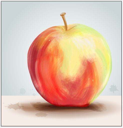
 The effect used to create this apple image is very interesting because it looks like a painting, however was just done on illustrator. To do this, you would trace the outline of the apple with the pen tool, then create a bristle brush with the brushes panel and choosing the round fan option. Adjusting the opacity of the brush tool gives variation in the strokes. By overlapping the brush strokes there will be different saturation of color, while changing the color of the stroke to create the multiple colored effect the apple shows. You can paint in white for highlights on the apple to show a 3D effect. I believe you would either delete the image of the apple before painting in the colored strokes, or decrease the opacity so you have a reference to go off of. This whole effect was done with only a few tools on illustrator and gives an image a whole new look. This look is very loose and light and is visually appealing because it resembles a painting.
GRA 217 Section 5 Group 1
The official blog for GRA 217 with Sherri Taylor


I love that this image is representing a labor-intensive skill–painting–but it is created in a digital program. The designer did a great job of adding depth to the image by using the different colors. Also, the simple line in the background gives the impression that the apple is sitting on a counter. Simply adding two color boxes and changing the colors slightly was all that was needed to add dimension to the image. The use of splatters was also very effective because it gives more of a raw, natural feel to the picture. Well done.
I would agree with both of you. I love the streaky paint look and I feel like the look of the apple required a lot of trial and error to complete. The artist must’ve just experimented until they got the right look. However, I think the splatters are a bit random and out of place in the picture, but that’s just personal opinion.