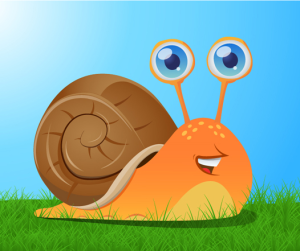
This image of this snail was probably created using a variety of tools in Adobe Illustrator. The basic shapes, such as the orange snail body and the brown shell, were created with the pen tool, focusing on curved lines. The gradient tool was used for the orange fill, since the color is lighter on bottom and darker on top. The ellipse tool created the small yellow ovals on top of the snail, and possibly the larger half-ovals near the grass (these ellipses were just trimmed in half). The pen tool was used for the orange part of the eyes, and the ellipse tool was probably used for the silver and blue part because the circles are nearly perfect. A blue gradient was used in the eyes, and light ovals created by the ellipse tool inside of the eyes create dimension and light. The pen tool was also used to create all of the small details (like on the snail’s shell and its mouth) and the paint tool was likely used to fill everything in. Since the snail was created with Illustrator, it looks imperfect. However, the imperfections make the image appealing.
GRA 217 Section 5 Group 1
The official blog for GRA 217 with Sherri Taylor


I think you did a super job of covering everything the artist must’ve done to create this image. I agree that there are some imperfections, one specifically that for such a bright picture the snail’s eyes seem to be a bit faded. However the artist’s use of gradient is quite impressive because it is hard to make gradient not look unprofessional.
The artist of this image used a lot of detail, such as the swirl of the shell and the individual grass pedals. Nicole most definitely covered what the artist did in order to create this fun image. The artist used clean cut lines, and the gradient in the fill of the image make the image have depth and make it look smooth. It’s cool thinking that we can make images like this with only a couple tools in Adobe Illustrator.