
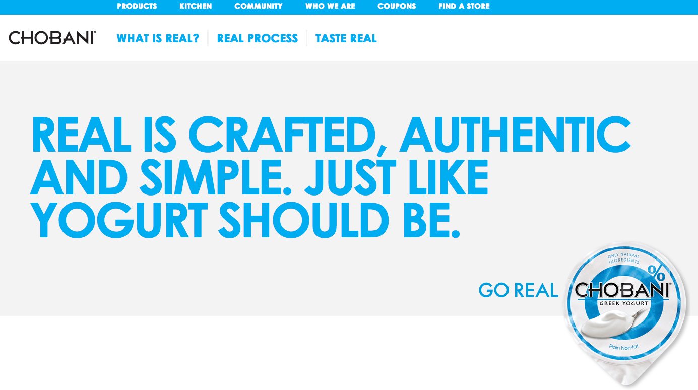
 On the Chobani website’s home page, the design is clean and simple while maintaining a bold edge. Emphasizing the white space, the page is dominated by a specific blue color and white as it creates continuity of the colors of their plain original yogurt. Next to the Chobani wordmark there are three headings: “What is real?” “Real Process” and “Tastes Real.” By clicking on each of these tabs, it automatically scrolls you down to a further down section of the page.
 “What is real?”
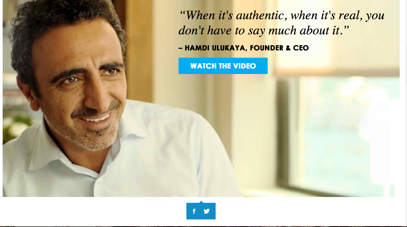
In the words of the Chobani founder and CEO, customers are offered to watch a video which can then be linked to either Facebook or Twitter as indicated by the two icons under the video–an easy way for customers to show their support through social media.
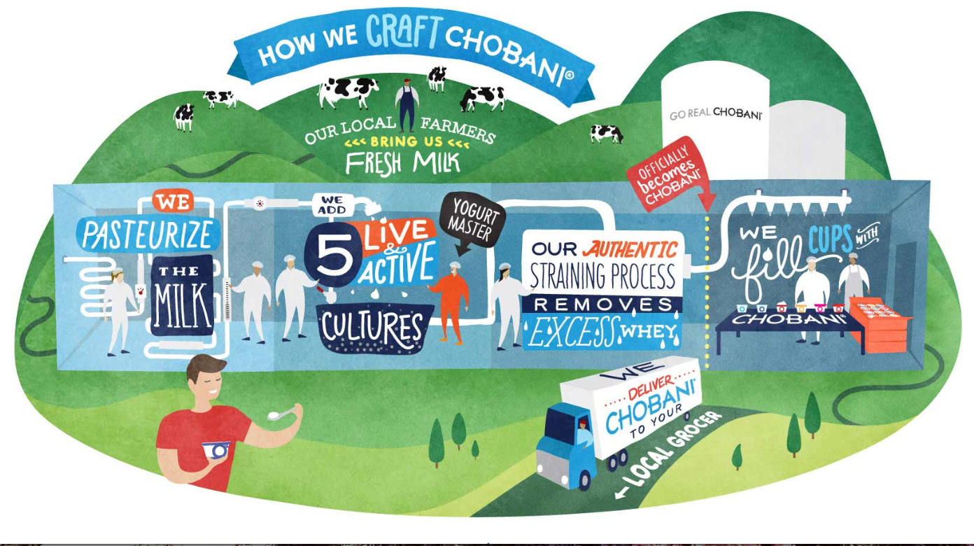 “Real Process”
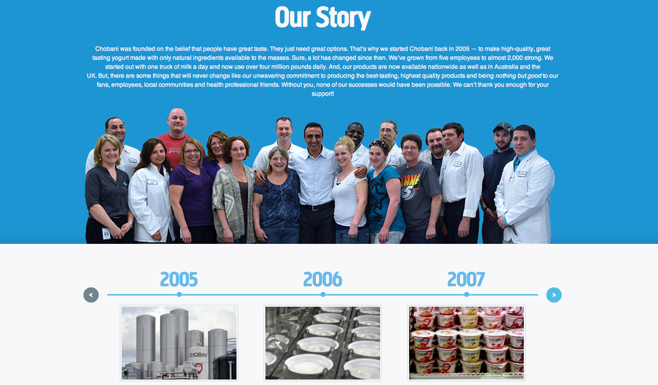
I really was drawn to this cute and colorful depiction of the process Chobani uses in producing their top-quality yogurt products. With a variety of different typographic styles and techniques, it all works together to create an interesting and captivating picture that is meanwhile informative.
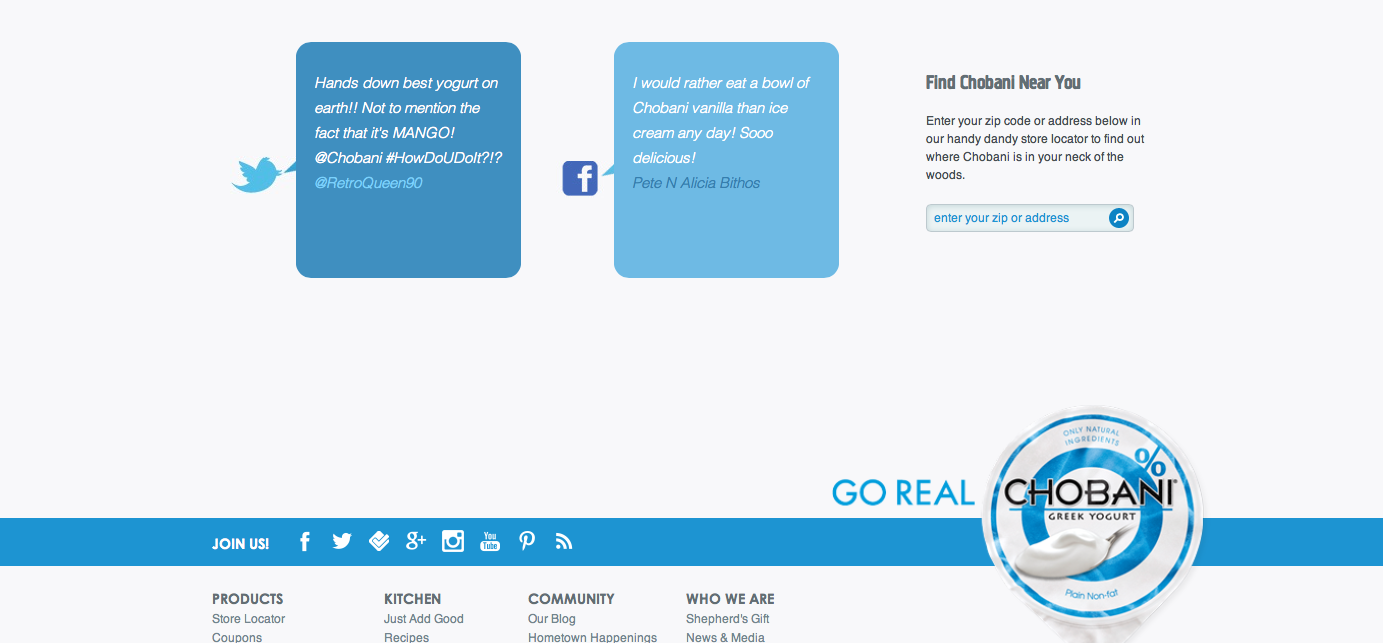 At the bottom of the page, cartoon speech bubbles show the words of real live customers that are either tweeting or facebooking about Chobani which informs viewers of other opinions as well as encourages them to share their own experiences through social media. I also really like the continuation of the color scheme as it focuses as well as emphasizes the yogurt on the bottom right which is in line with a rectangle across the bottom with tools in which to share information. I think it flows together really nicely.
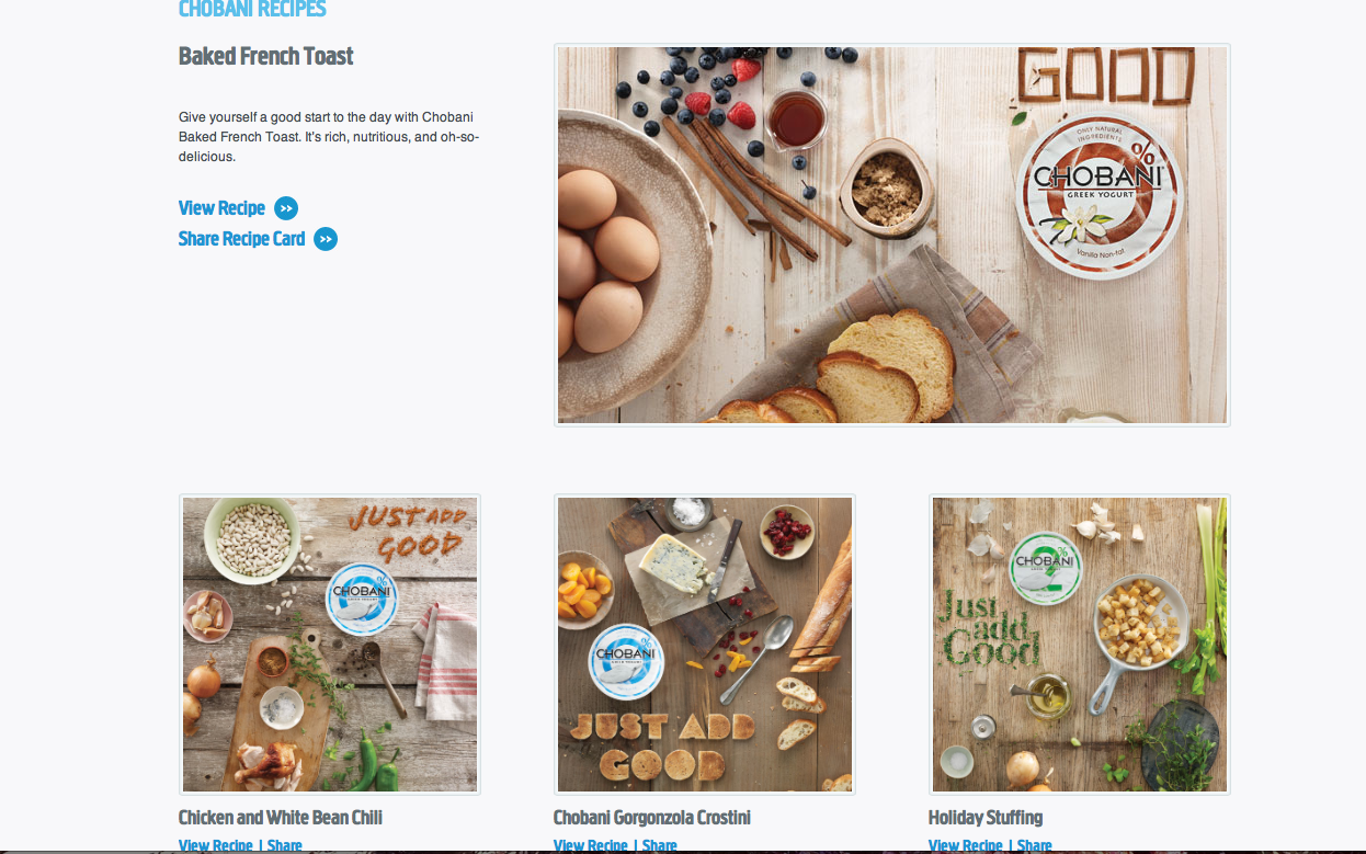 In accordance to their philosophy of natural and healthy eating, it makes sense that Chobani would go the extra mile to include a section of their website dedicated to health-conscious cooking recipes. The easy recipes that promote their own products encourages customers to not only eat healthy, but also to eat their healthy products.
 In the end, Chobani’s website is effectively designed to attract customers who are likely to fall in love with the company’s natural, health-conscious ways. I am drawn to their website as its simple, color block design and attention to detail creates a unique web layout to entice viewers.


I agree that Chobani’s website is extremely interactive. It’s also fun to navigate, which fits into their brand. I think the success of a site depends on usability, and Chobani definitely achieves that. It’s very interactive, with the social media links and videos. The large images and consistent color scheme also make it a very attractive design.
I love the interactivity of this website. I think if a website isn’t interactive then it is likely to just to blend in with all the others. Not that blending in is a bad thing, being typical and predictable makes it so that consumers can easily navigate through your website etc. However a very good website does definitely stand out and the slight challenge of trying to figure out a website that doesn’t necessarily follow the typical set-up is intriguing and kind of a challenge.
I also think that the “Real Process” page can only improve Chobani’s reputation among consumers. Since the explosion of the secrets of the meatpacking industry in the early 1900’s and even secrets coming out now in documentaries like Food Inc. it is important for many consumers that they know exactly what’s going on with their food. This transparency builds trust.