http://obo.co.nz
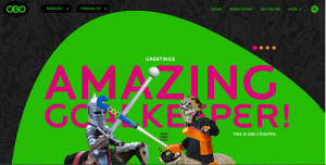
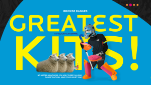
The website I chose to comment on its impressive design is OBO. OBO is a brand of field hockey goalie equipment that makes everything from sticks to goalie pads. I included three screen shots to show the navigation tools and the full images of the home page. To start with the basics, the website is extremely easy to navigate. It’s organized into sections telling you about sizing, where to buy, and shows all of the products. What really makes this website incredible, however, is its awesome graphics. They’re humorous and still relate to the product. The colors are bright and it is all very attractive. Although I have no need for a goalie stick, the website does a great job of advertising them to make me want one.


I agree. The website follow the very basic idea of web design strategies. It’s very easy to read by using clean pictures and big titles. It also use the contracting colors, like red and green, blue and yellow to create a vivid picture. Though it’s not elegant designed, I think the website did a good job giving useful information and navigating easily.