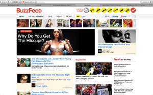
figure and ground: Buzzfeed uses a white background, therefore all of the objects on the page are distinct from the background and makes the page and the articles alluring to its readers. This especially true when they put the headers in red or yellow.
proximity and alignment: the same font is used throughout the whole website which creates a sense of unity, and works very effectively for this website.
continuation: Everything on the buzzfeed website is very aligned and linear. They do a great job on this idea of continuation. In my opinion, this further adds to the websites unity.
visual hierarchy: The website definitely follows the visual hierarchy principle since all the all eye catching parts of the website are on the top of the page and lead your eyes to the main and most important content of the site.


I think the two very important parts of the makeup of BuzzFeed is their use of visual hierarchy and continuation. The set-up is very conducive to scrolling and looking things over quickly. By keeping everything in three columns (more or less) viewers become very adjusted to the layout and once they are familiar with it, they can scan content even faster. Visual hierarchy is also important for BuzzFeed because there is a lot of content and a lot going on on the pages. The website could easily be a confusing mash-up of content but instead, it reads very clearly. I think this is due to their use of headlines and pictures and subheads/captions to go with stories. A person may first see a picture and then if that intrigues them they’ll go on to read the headline and if they’re not interested, they can move on very easily to the story below it.
This website is sort of a interesting example of gestalt considering that it has a pretty standard layout. the options menu is aligned nicely on the top right hand of the screen and the focus feature are all displayed very prominently. The strength as far as gestalt goes is how the visual hierarchy is utilized. There is a clear progression of content that our eye is meant to scan through. Even for someone with relatively little training in graphic design (such as myself) the path is still exceptionally clear. That is why is a well designed site.