This class was extremely helpful. Before I had absolutely no knowledge on any of the adobe programs. I really enjoyed every single project, however,my two favorites were the resume and the ipad projects. The skills that I learnt in this class will carry on with me for a very long time and will be very helpful in my career in advertising. Although this class had a heavy workload, i am sad that it is over.
Author Archives: Olivia Arty
ipad project
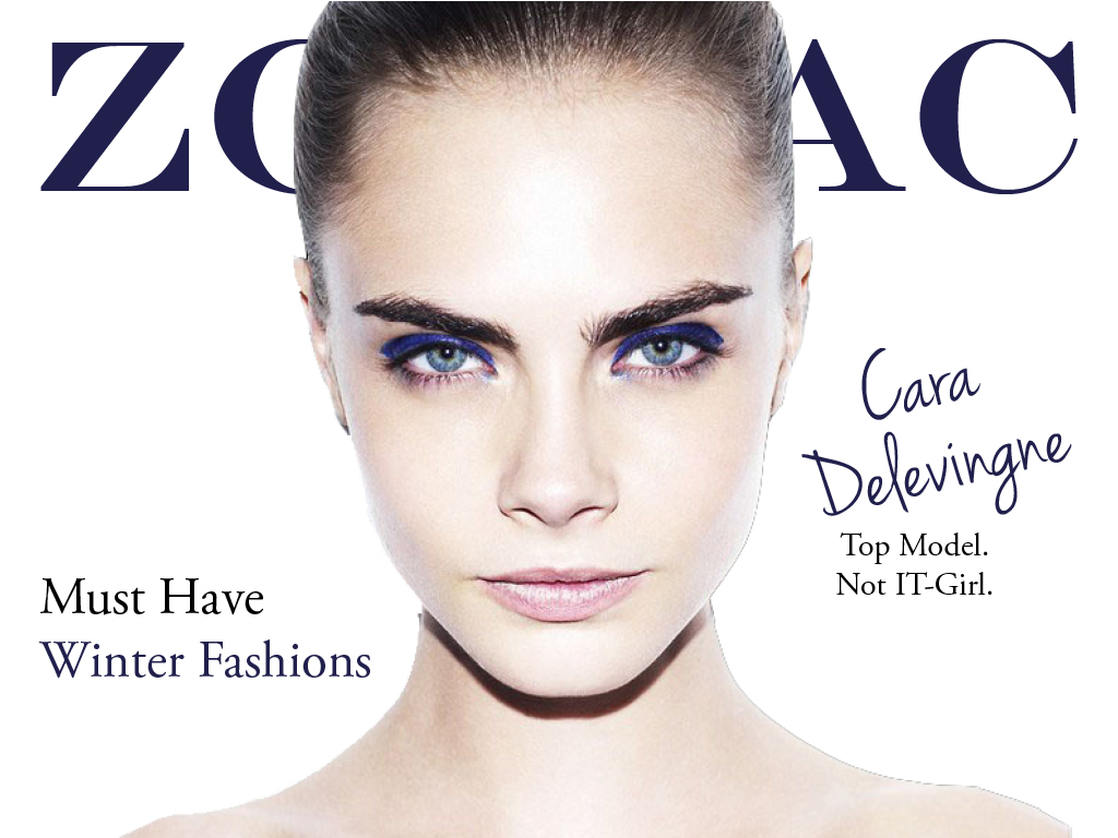

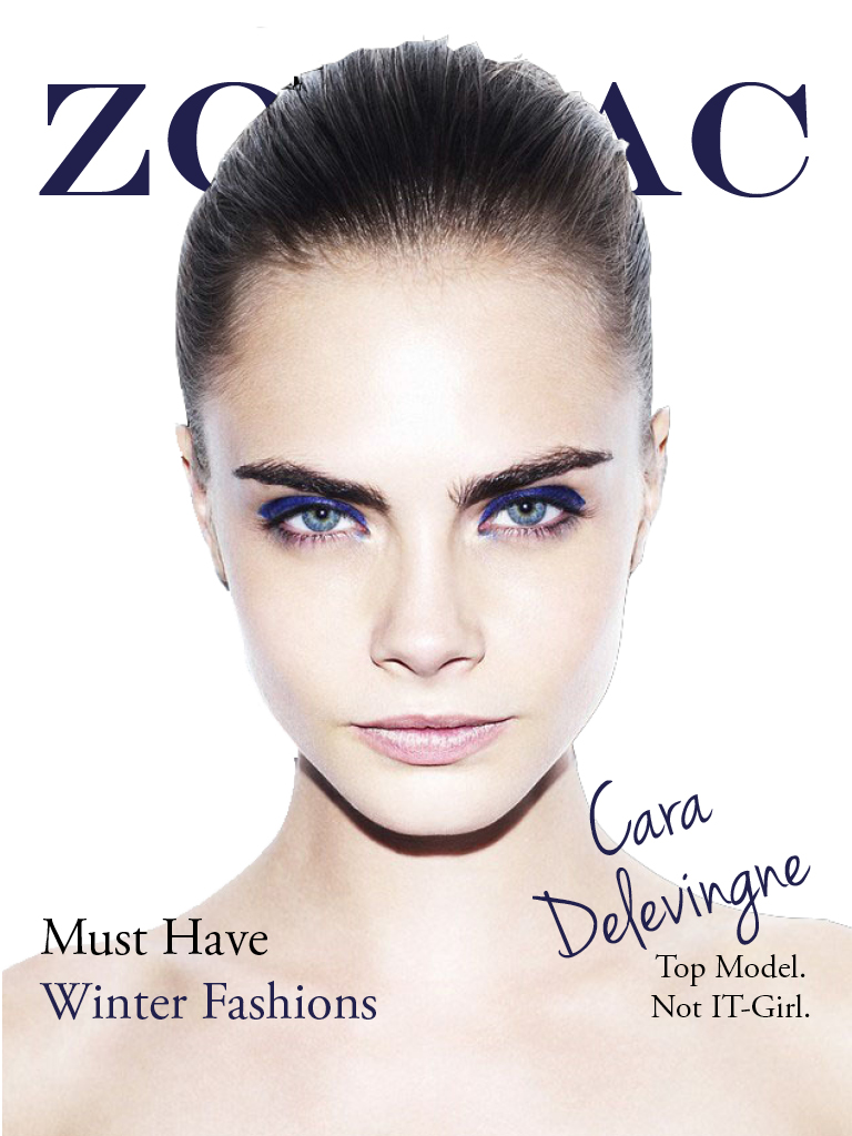
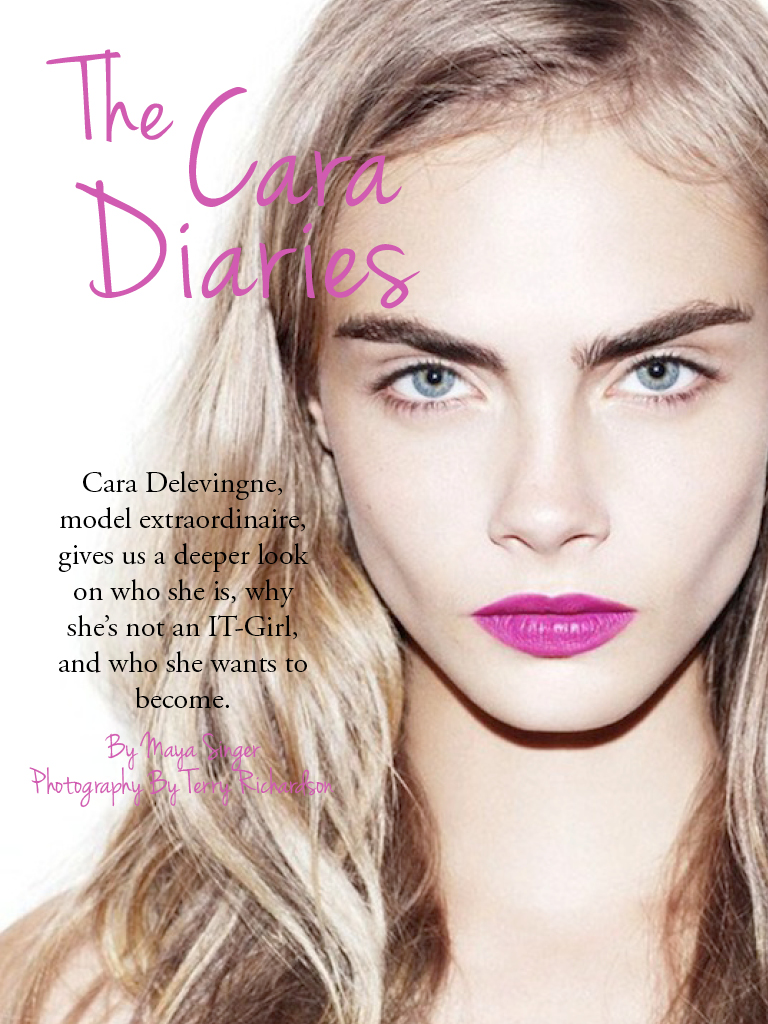
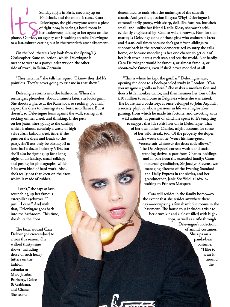
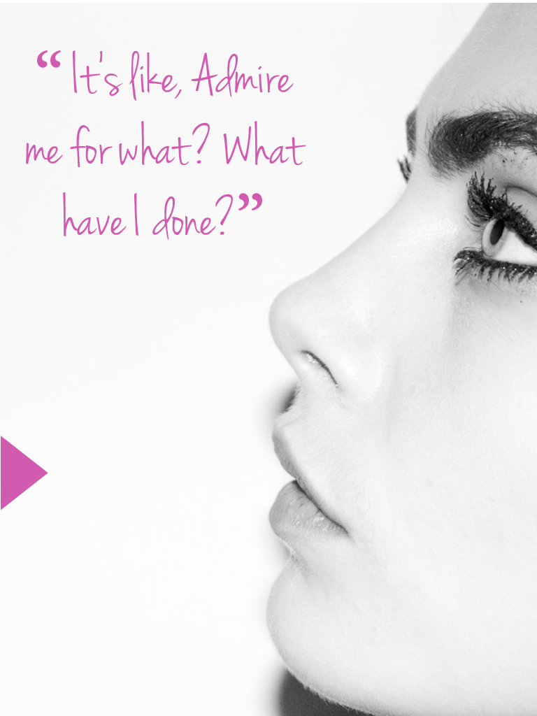
Ipad Magazine Cover
The type on this magazine is very readable and modern. I love how they stayed with with black and white. It lends the cover to be very simple and allows will ferrel to really be the focal point of the cover. Also there is relatively very little content on the page. Furthermore, compared to regular magazine covers there isn’t that much type.

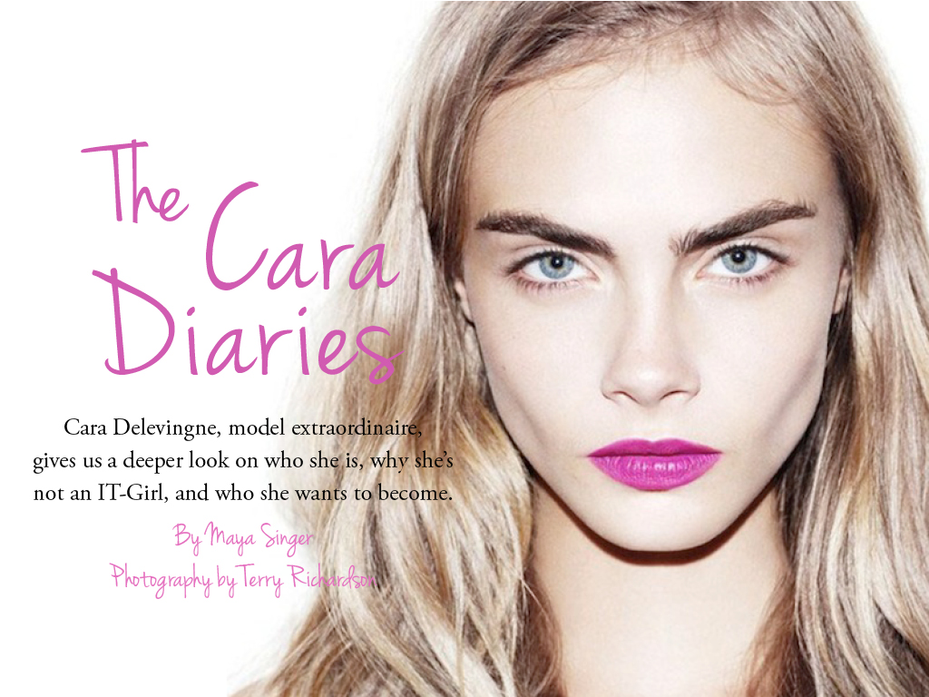
Headline
I loved this headline and deck; it’s very captivating, and makes me want to read the article. It does a great job of catching the attention of the intended audience and follows the personality of the magazine.
Web Design

Logo
![]()
I wanted to keep my logo very simple so I decided to work with just the “O” from my first name and the ‘A’ from my last name. After looking at the letter for a while i realized that I could over lap the letters and have part of the O be the middle stem of the A.
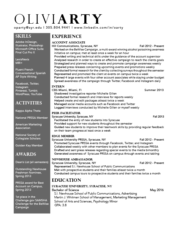
Resume
Poster

Website photo
I know I have used this website as an example before but Zara’s website fit this assignment perfectly! They use this photo on the home page of the website. I think it really shows the personality of the brand. Zara is a very trendy, modern, clean-cut brand, and this background describes that perfectly with the movement in the photo and very neutral color scheme.

Gestalt
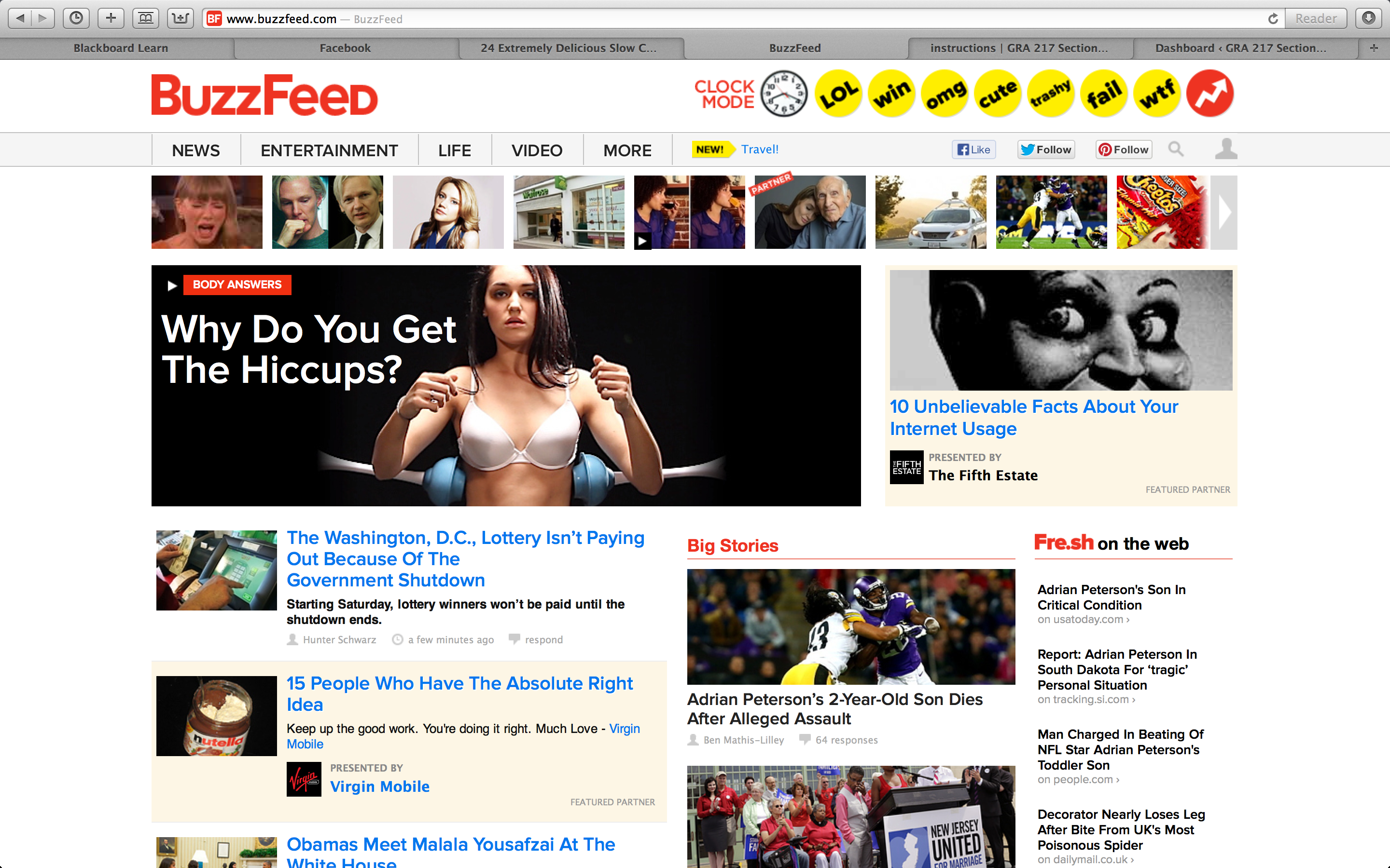
figure and ground: Buzzfeed uses a white background, therefore all of the objects on the page are distinct from the background and makes the page and the articles alluring to its readers. This especially true when they put the headers in red or yellow.
proximity and alignment: the same font is used throughout the whole website which creates a sense of unity, and works very effectively for this website.
continuation: Everything on the buzzfeed website is very aligned and linear. They do a great job on this idea of continuation. In my opinion, this further adds to the websites unity.
visual hierarchy: The website definitely follows the visual hierarchy principle since all the all eye catching parts of the website are on the top of the page and lead your eyes to the main and most important content of the site.