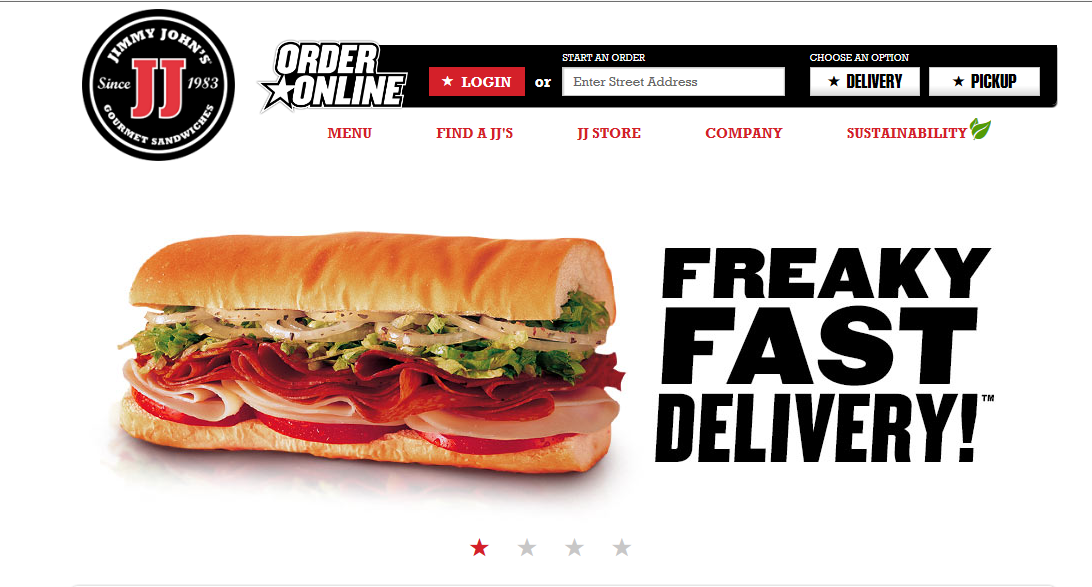
FIGURE AND BACKGROUND: The obvious figure in this case is the sandwich. The background is completely empty which lends further focus to the details of the sandwich and how delicious it looks.
PROXIMITY AND ALIGNMENT: The header, which lies next to the sandwich is in a font that carries all capitals that are thick and strong. There is a slight tilt to the right which suggests motion. These sandwiches are FAST. The menu comes in a different typeface and different color. This creates a contrast to let the viewer know exactly what each component is
CONTINUATION: There is not a lot of content on this page and the simplicity lends to the viewing pleasure. All of the information is grouped neatly at the top right corner in the information bar. To the left is the Jimmy Johns logo and then there is nothing else. Everything is tied together in one continuous form.
VISUAL HIERARCHY: The clear and dominant component of this web page is the sandwich. It dominates the scene with all of its colorful greasy and delicious detail. The web page is an advertisement for the product itself. This is the first and last thing you will see with continued glances back at it during the visual scan of the rest of the page.


This website has the strongest gestalt that I have seen. It completes every aspect of gestalt exceptionally. Its simplicity makes the layout very effective and clearly portrays the message that Jimmy Johns delivers delicious sandwiches fast.
As far as covering all of the Gestalt principles, the Jimmy John’s website definitely does an awesome job of it. However, there is so much concentration on the sandwich that you look at it almost too much and at a point it almost doesn’t look appetizing. Food is so difficult to photograph so that is one thing that has to be considered when its being used as a focal point.