
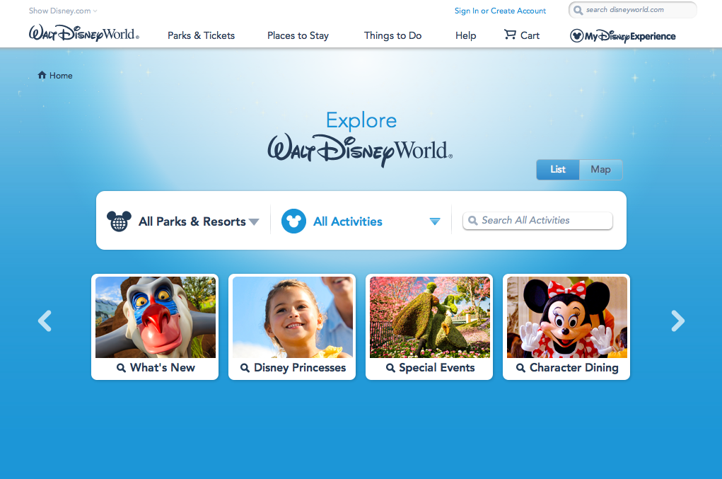
Figure and Ground: The Disney World website establishes differences between the blue background and the links for Disney Princesses, special events, etc. It makes the links stand out by giving them a vivid picture surrounded by a white background that makes it pop. The links at the top also stand out against the white background.
Proximity and alignment: The same font and color is used throughout the entire website. It is mainly a white background with blue accents to stick to Disney’s main colors usually displayed in their logo. The font also comes in many different forms. As seen on this page, it has a bold type and a light or regular type.
Continuation: The headers on the top of the page consist of drop down menus with many different options. The links in the middle of the page also suggest a drop down menu as they have a downward arrow positioned next to them.
Visual Hierarchy: On this page, the designer uses the images to create visual hierarchy and distinguish which links are more important than others. They also include the white boarders around the “All Parks & Resorts” link against the blue background to reiterate which links are more important on the page.


What I like about the page is how the designer was able to make use of white space around the content in the center, and still make the page seem full. The light blue colorway in the back meshes well with the white colors in the center, and also allows for the black text in the center to stand out.