Scavenger Hunt: Carli Aluotto, Sarah Richheimer, Kevin Claffey, Eric Gordon

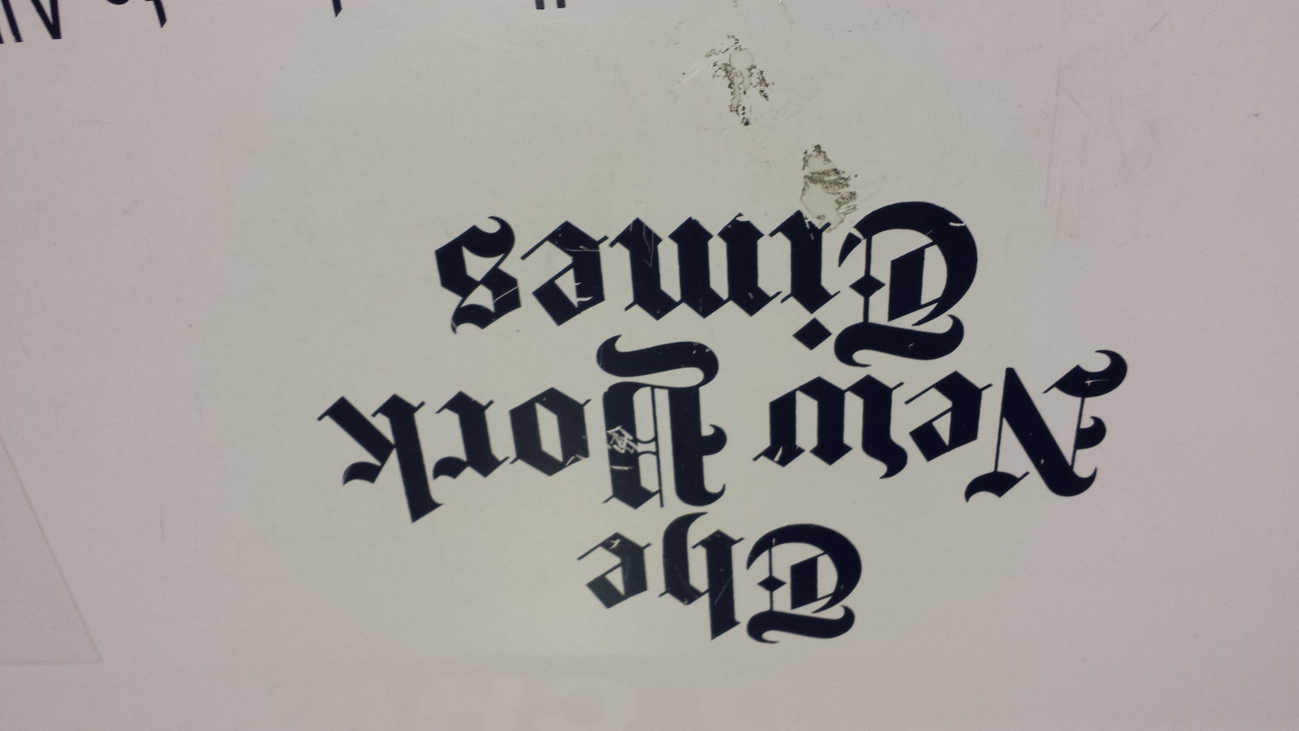
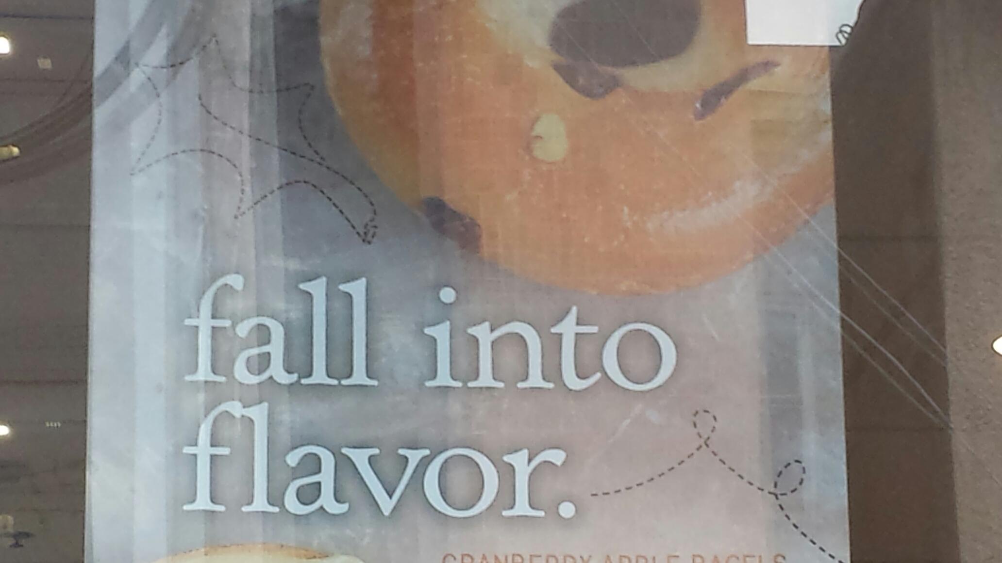
1. Old Style serif type in signage

20131202_150243-2

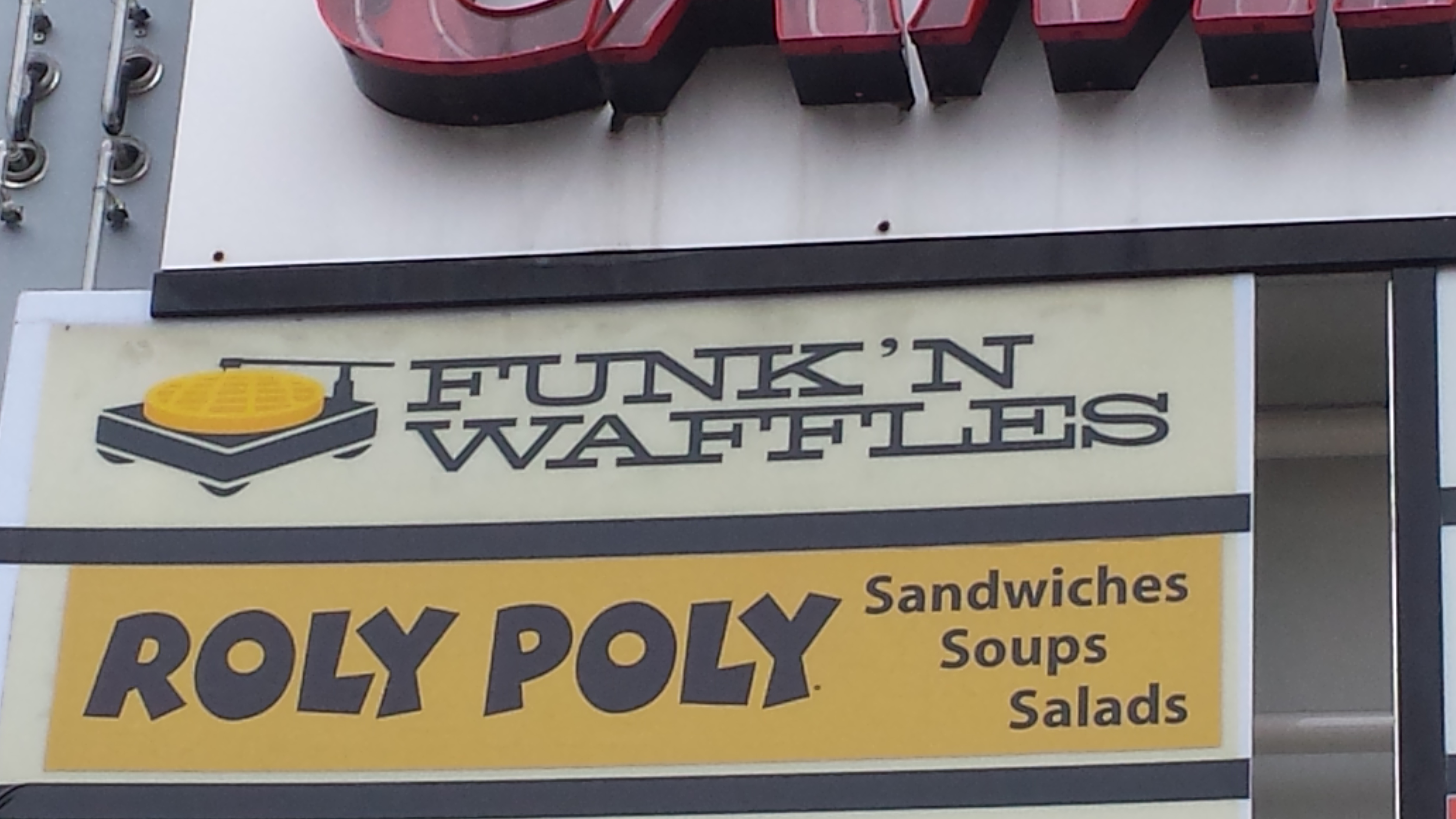
2. Modern Serif type in signage (Funk’n Waffles)

20131202_144558

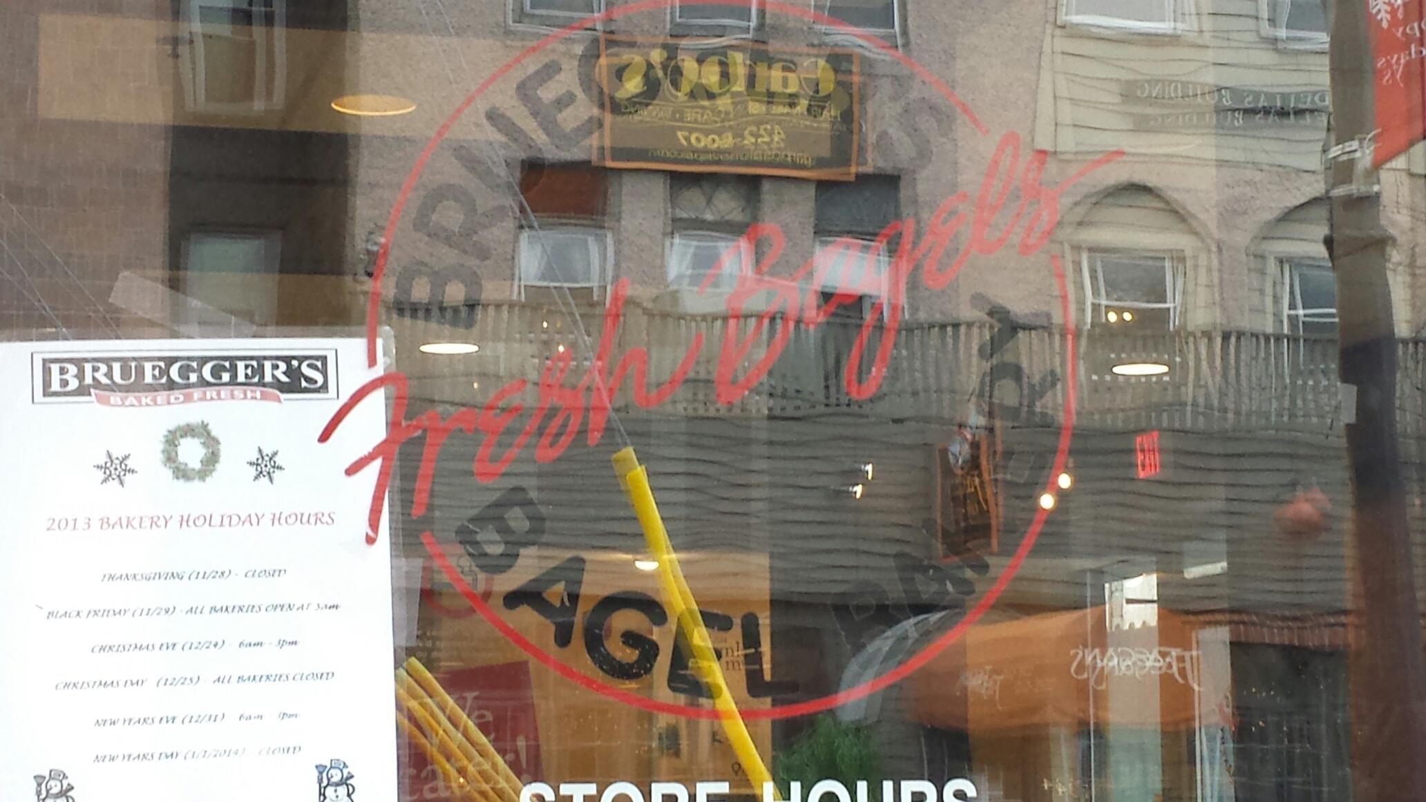
3. Script or cursive type in signage

script

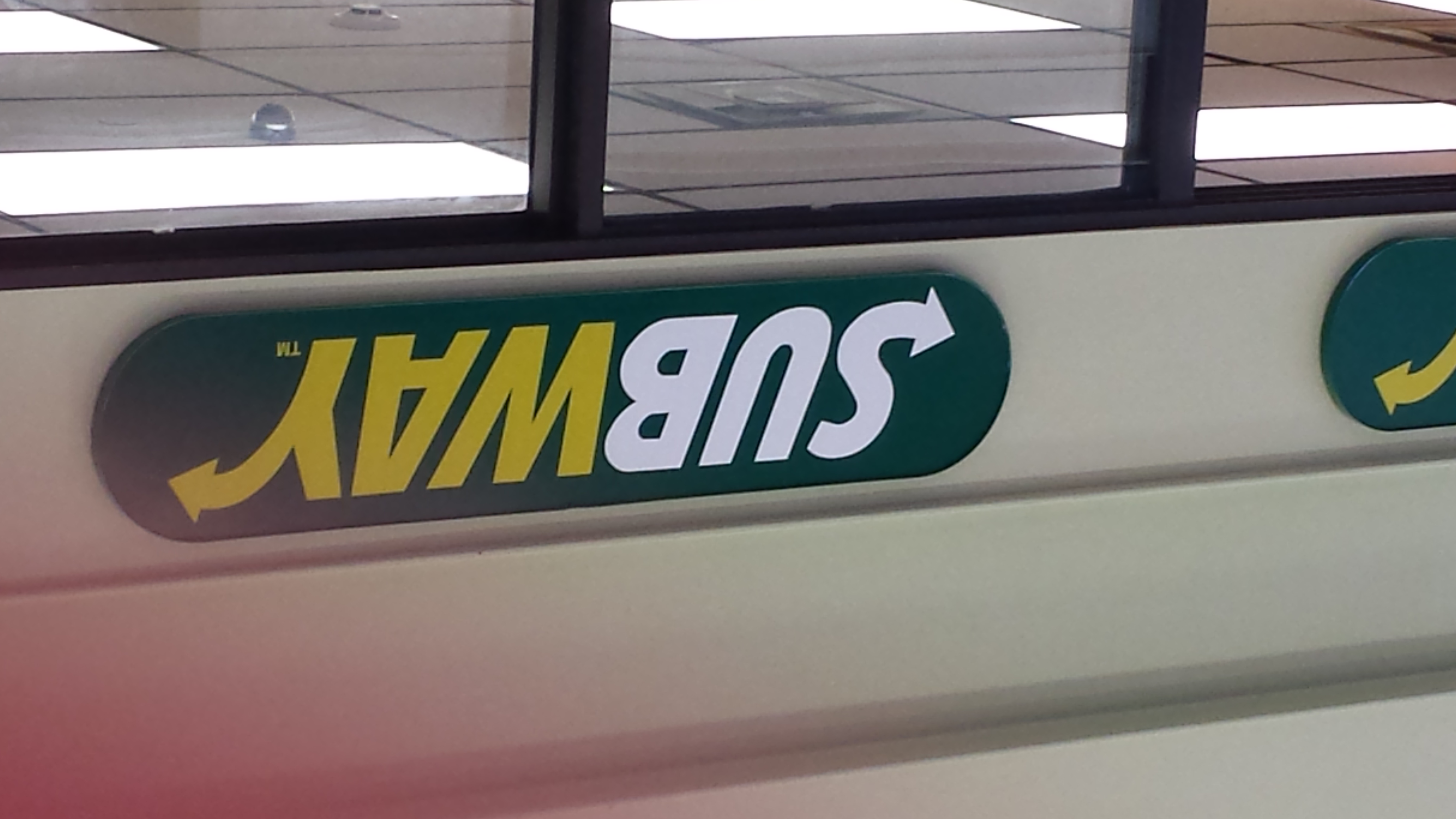
4. Slab serif type in signage

20131202_145636

5. Pictographic logo

dreams

6. An effective logo

insomnia

7. Silhouette form in a logo

chipotle

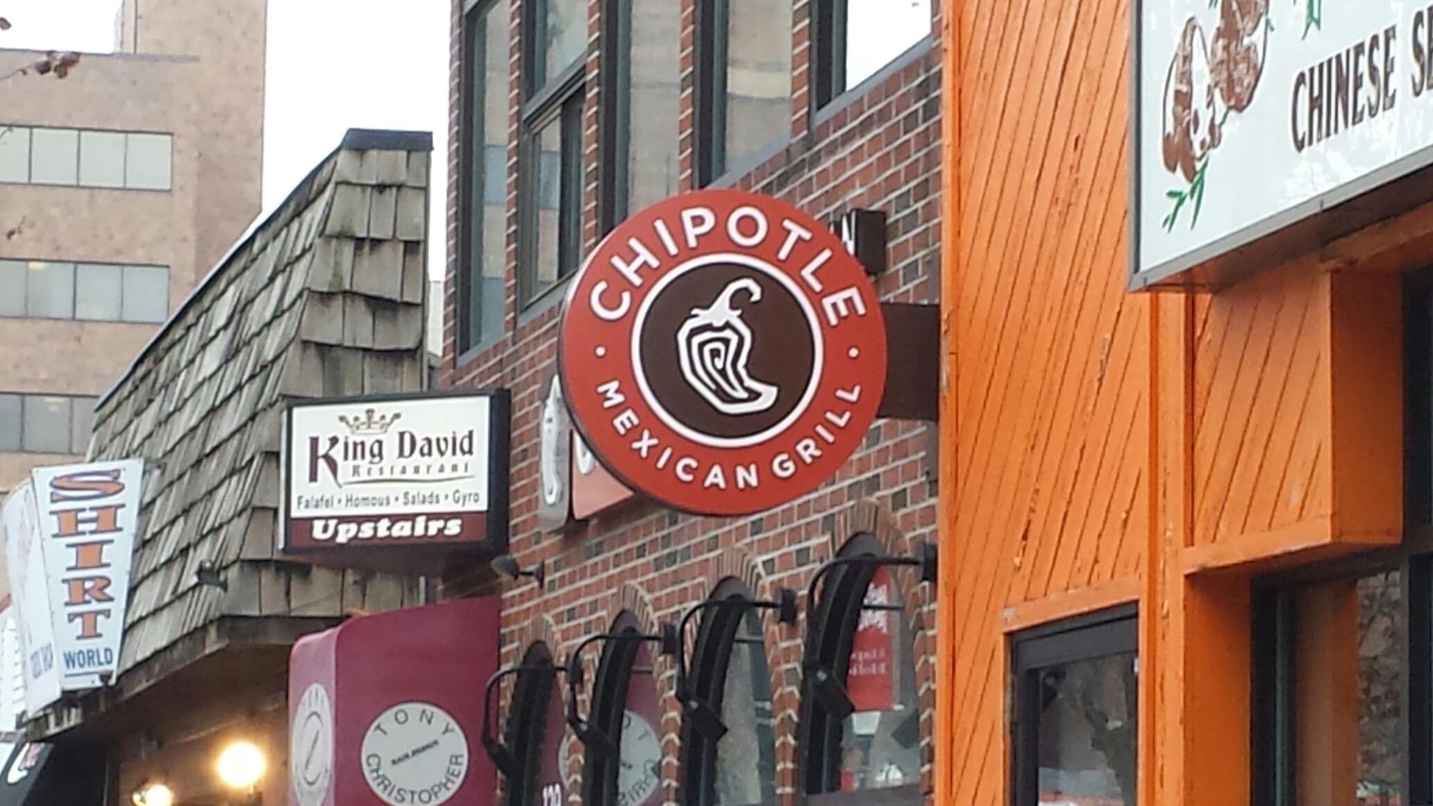
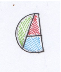
8. Analogous color use

20131202_145408

9. Complementary color use

dunkin

10. Color repetition from visual to type

trop

11. Isomorphic correspondence in visual use

20131202_145250

12. path or continuation in visual use

20131202_145840

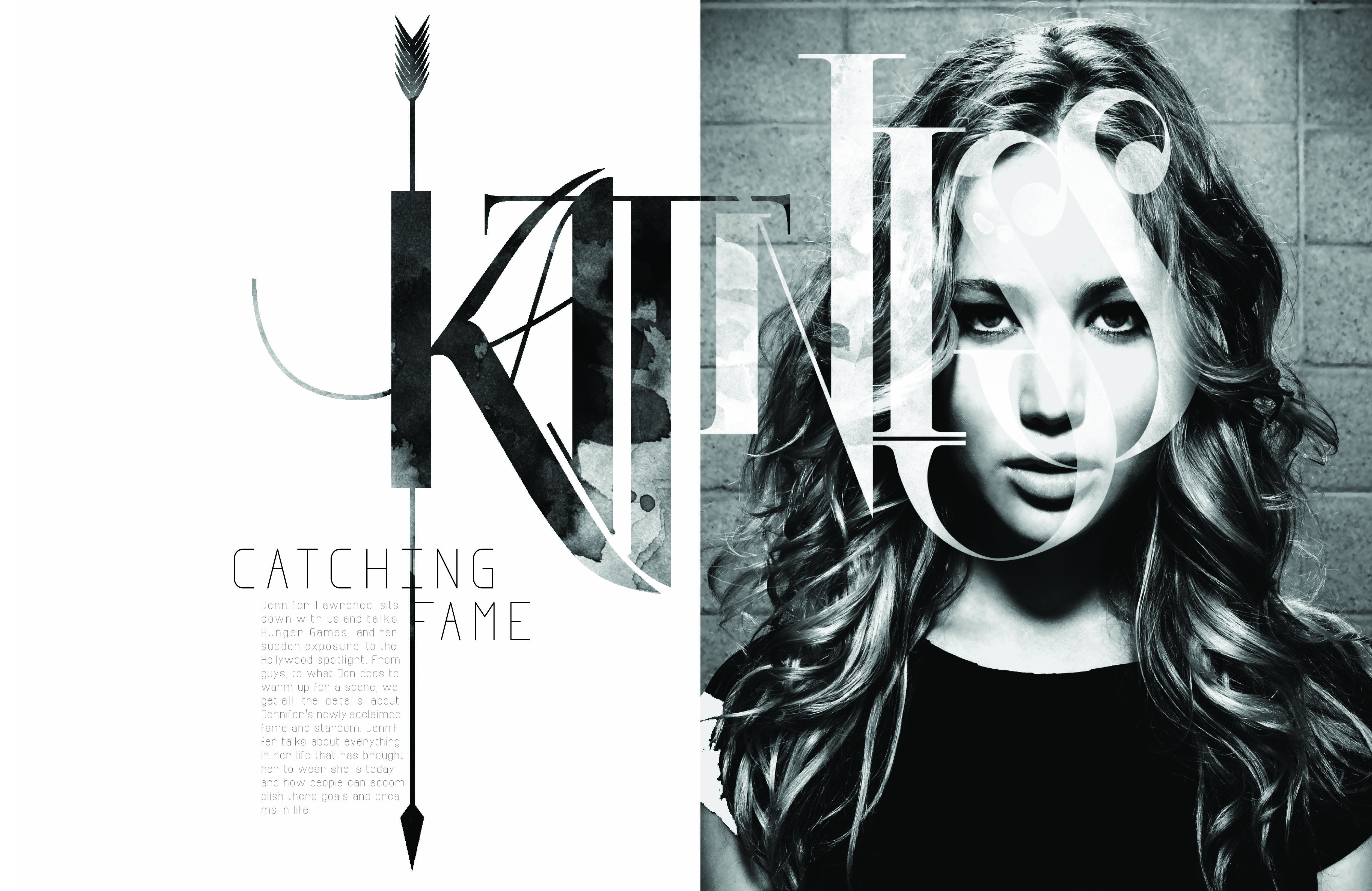
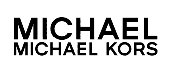
13. Word emphasized in type size in a headline display

verizon

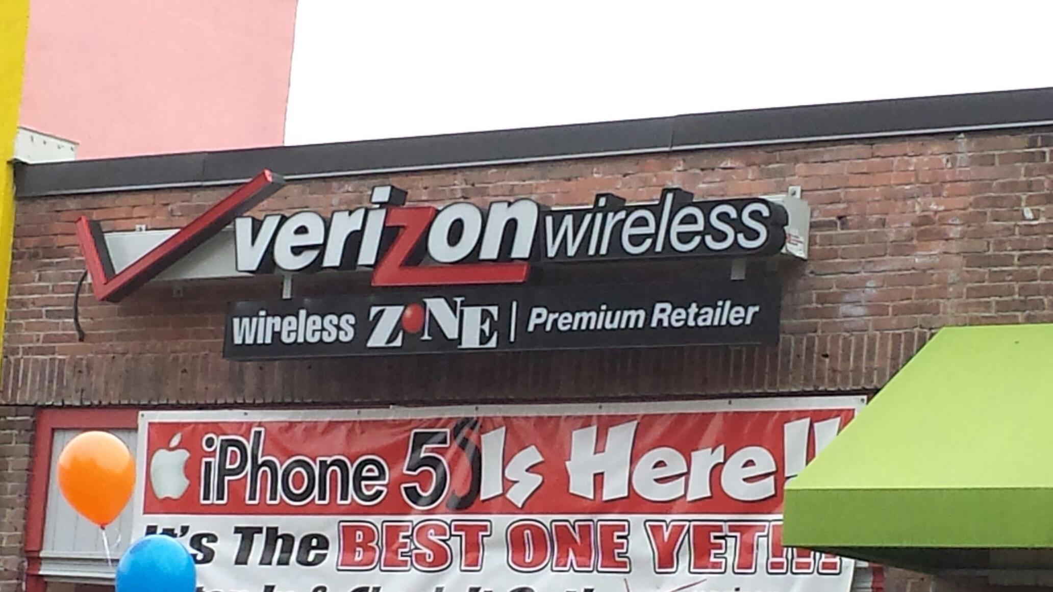
14. Word emphasized in color in a type display

bagels

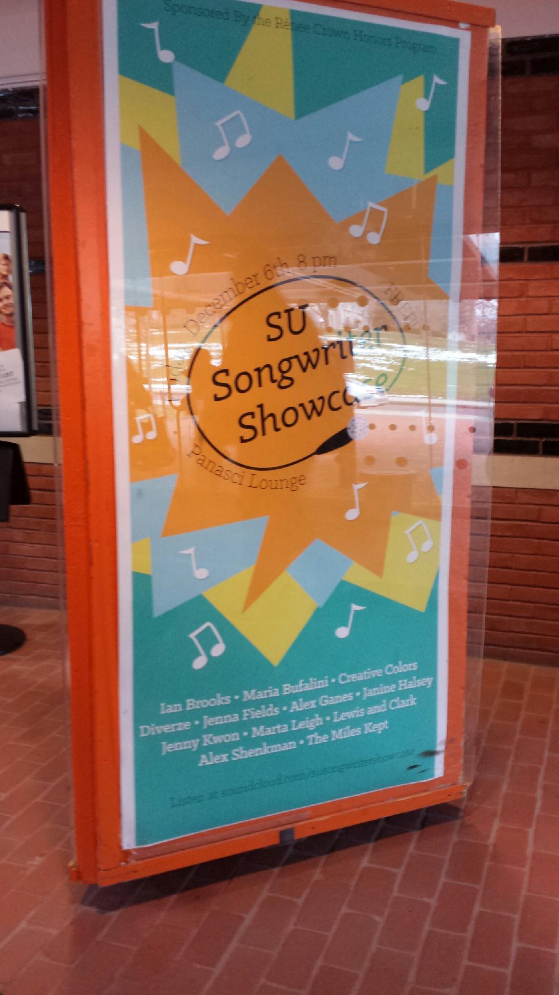
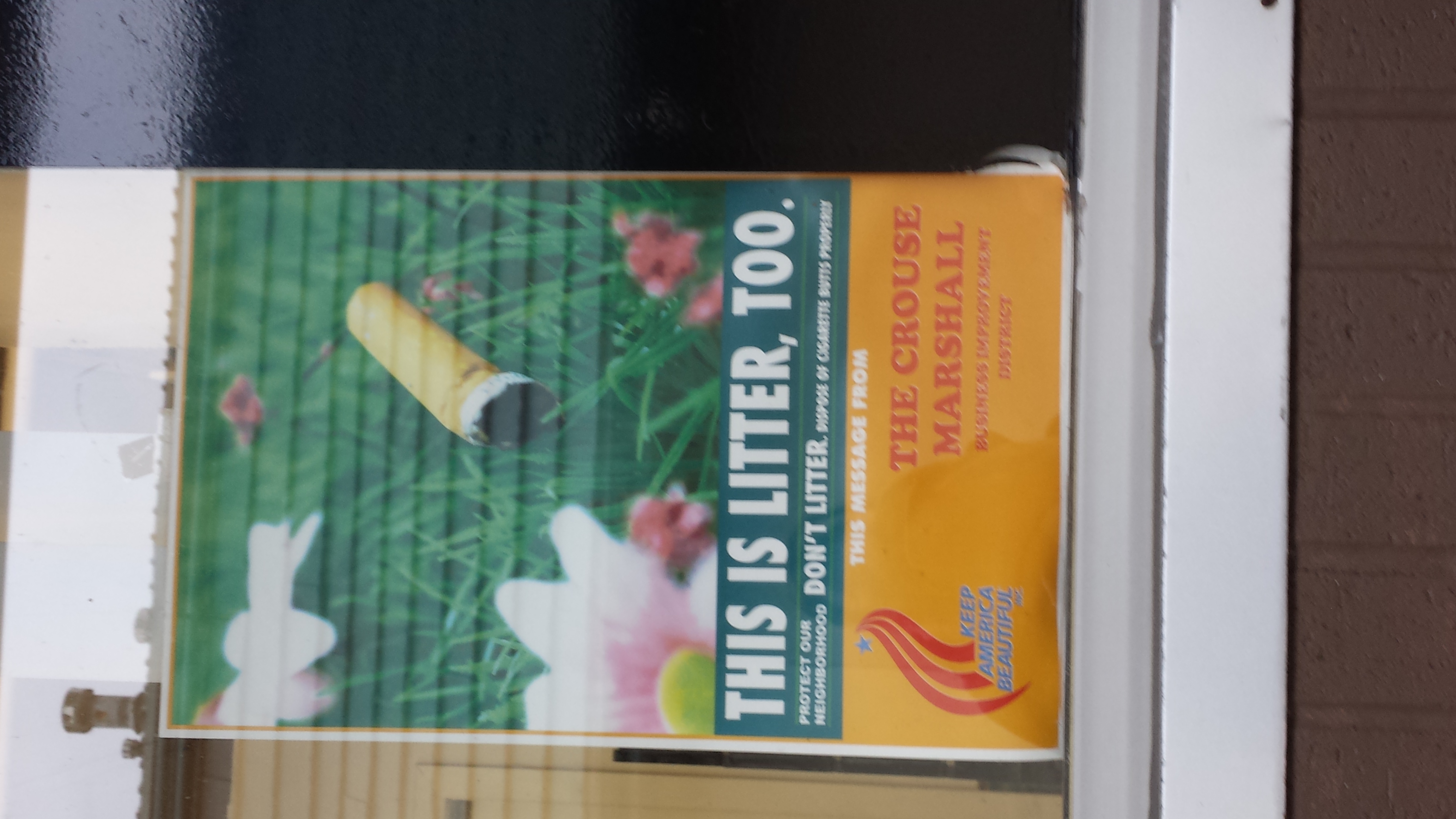
15. A good poster design

good

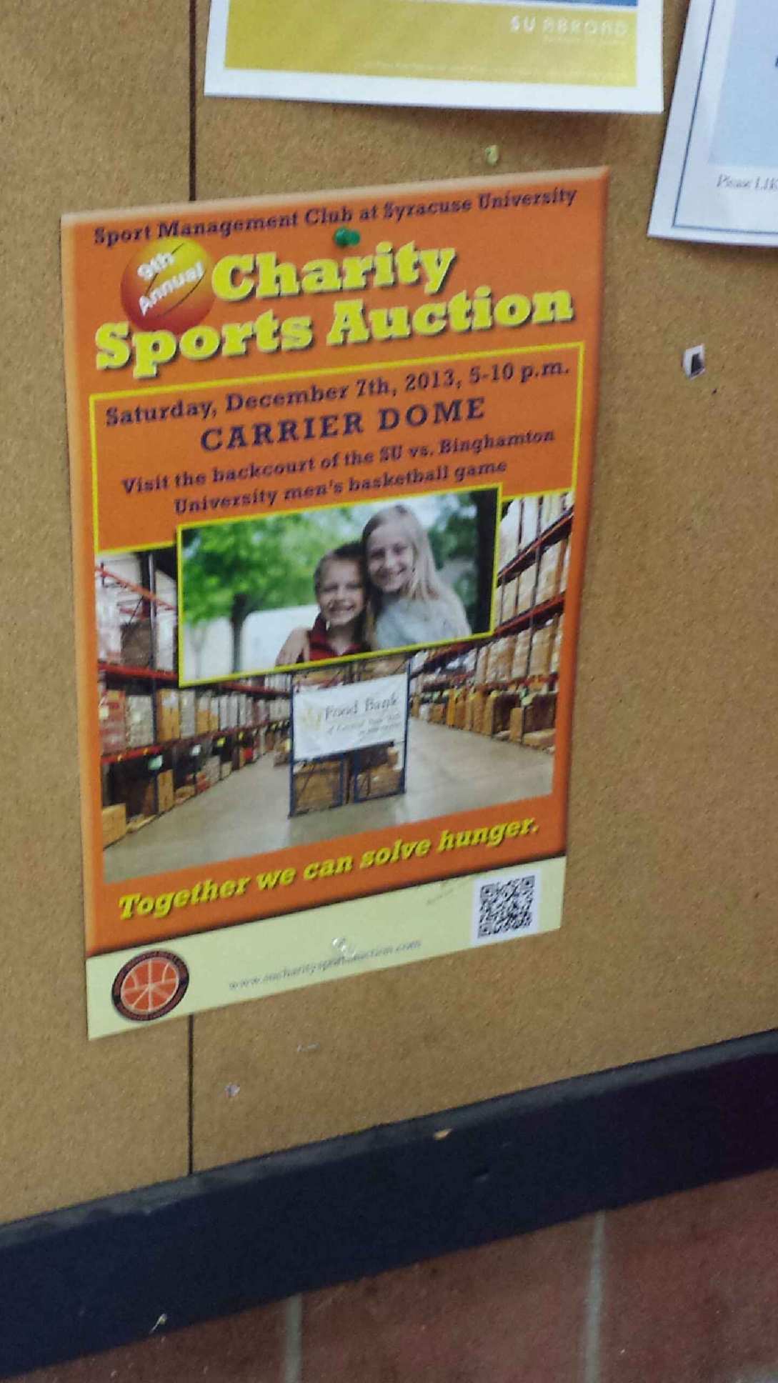
16. Use of a picture showing rule of thirds

bagelssss

17. Use of a picture showing leading line

thirds

18. Use of a picture showing stopped action

people

19. An environmental portrait

20131202_144825

20. Something in nature that looks like a letter (Y)

tree

Head and Deck

Headline: Miley Goes Bang

Deck: With her devil-may-care attitude and rocking new sound, the pop star proves she still can’t be tamed. By Derek Blasberg.

I think this head and deck are very clever because they refer to two pieces of her music (her new album Bangerz and her old song “Can’t Be Tamed”). The deck also successfully introduces you to the topic they will be discussing in the story.

(From Harper’s Bazaar, October 2013)

Magazine Spread Design

katniss_fook_final


I really love this two page spread, and not just because I love the Hunger Games. Although this design shows no color, it is far from plain and simple. The typeface used for “Katniss” is extremely creative. The designer also incorporated a different picture within the typeface to contrast from the picture of Jennifer Lawrence. The texture seems to be either dirt or blood stained, sticking to the theme of the movie. The arrow going through the K also fits perfectly with the theme of the written piece (which is about Jennifer’s role in the movie) because it is one of the main sources of survival for Katniss. The designer further perfected this design by making the arrow go through the K in Katniss, the I in Catching and the F in Fame. Not to mention that Jennifer Lawrence looks absolutely beautiful.

Logo

Scan 1


At first I came up with this generic logo, but I didn’t like it because it had no character and seemed like a boring micro processing company logo. Then I came up with this….

Scan


There were many different drafts of my logo before I finally came to this one. I tried to incorporate the A of my last name into the C of my first name and I came up with this cool, colorful, and fun shape. I plan to make this on illustrator and incorporate it into future projects or business cards.

Week 8 Post: Photo

Screen shot 2013-10-06 at 10.25.58 PM


For this week’s post, I decided to use the Smucker’s webpage again because it has such wonderful photos. All of the photos on this page have a center of interest, they are clear with vivid colors, and they display what Smucker’s is all about. These photos show that Smucker’s is a family oriented company and that their products are meant to bring families together. The designer chose these photos because they most likely attract the attention of family oriented mothers and fathers with young children. The photos aren’t necessarily the lightest, however, the white font is readable against the photo and adds some contrast to the image and page.

Gestalt: Walt Disney World

Screen shot 2013-10-11 at 11.58.22 AM


Figure and Ground: The Disney World website establishes differences between the blue background and the links for Disney Princesses, special events, etc. It makes the links stand out by giving them a vivid picture surrounded by a white background that makes it pop. The links at the top also stand out against the white background.

Proximity and alignment: The same font and color is used throughout the entire website. It is mainly a white background with blue accents to stick to Disney’s main colors usually displayed in their logo. The font also comes in many different forms. As seen on this page, it has a bold type and a light or regular type.

Continuation: The headers on the top of the page consist of drop down menus with many different options. The links in the middle of the page also suggest a drop down menu as they have a downward arrow positioned next to them.

Visual Hierarchy: On this page, the designer uses the images to create visual hierarchy and distinguish which links are more important than others. They also include the white boarders around the “All Parks & Resorts” link against the blue background to reiterate which links are more important on the page.

Web Design: Smucker’s

Screen shot 2013-10-06 at 10.25.17 PMScreen shot 2013-10-06 at 10.25.41 PMScreen shot 2013-10-06 at 10.25.58 PMScreen shot 2013-10-06 at 10.26.22 PM


I personally love Smucker’s web design. They use a lot of colors and stick to a certain theme by incorporating a lot of pictures that have to do with each section of the website. I love how on the home page, as you scroll down the page it tells you Smucker’s mission and what they are truly about. It incorporates beautiful pictures of fruits and and foods that you can make with their products. This web design also gives off a happy feeling making you want to explore the website even more, essentially becoming more aware of the company and their products, which could lead to purchasing the product. This website gives me a lot of ideas that I could use in my web design.

Week 4 Post Typography

advertising,illustration,nike,typography-79d4814c95665a5d1cf3010e5a12e12f_h


I thought this advertisement for Nike and Adobo Magazine was really cool. The typography in the advertisement is designed to look like a Nike sneaker with the famous Nike swoosh on the side. The shoe reads “One of the world’s most famous logos was designed for a mere 35 dollars by an art student. Learn more about the World of Advertising. Read Adobo Magazine.” Nowhere in the advertisement does it say anything about Nike, however, you can just tell by the swoosh and the statement regarding “the world’s most famous logos.” Also, the space between “the World of Advertising” and “Read Adobo Magazine” suggests that the sneaker is of the Nike Air type. The typeface used is in all caps and morphed so that the type fits the figure of a Nike sneaker.

Week 2 Post

Unknown-2Unknown-3

I thought the difference between Pacsun’s new and old wordmarks were quite interesting. The first wordmark uses the color yellow to emphasize the fact that most of Pacsun’s merchandise is used in the summer time or when it’s sunny. Hence why the S in Pacsun has rays around it as though it is the sun. On the other hand, the second logo is very simple, using plain black, bold typeface. This second wordmark gives Pacsun a cleaner and more prestigious look as though they are trying to change their look and target a demographic with a higher income. However, both wordmarks still hold some of the same characteristics. They both mix lower case and upper case letters within the wordmark. These letters are scaled to be the same size as well.

michael-kors_3747.jpg


Although this wordmark is very simple, it is known by many people, especially those of the higher income demographic. Michael Kors’s wordmark uses a thin typeface that displays simplicity and class. The letters in the wordmark are also all upper case letters to emphasize the importance of this brand name. Also, the kerning between each letter is the same, except between Michael and Kors. This is so that you can distinct the first and last name. Although these words are separated, they still work as a unit. This wordmark is very simple, but because of the name and style of the typeface it attracts the attention of it’s targeted audience.