Deck and Headline

gra 217 blog


This deck and headline work well together because the headline gives the essential information for someone to understand what the article is about.  The deck goes further into detail by giving background information about the topic as well as the name of who took the photo.

Magazine feature

mens health


Above is Men’s Health’s article published every month on a specific workout.  The layout of this two page article is what attracts my eye.  Men’s Health not only utilizes the directions of how to properly perform each workout, but has pictures to give readers an accurate description.  This simply layout and placement of text and pictures creates an easily navigable article that will entice readers to read all the way through.

Website Photography

Screen shot 2013-10-17 at 1.30.26 PMI chose spalding as a representation of a website with good photography because there home page caught my attention with all of the differnet pictures that it displayed. The photograph above is one in a set of images that rotate on the home page. I took a screen shot of this image in particular because I feel like it grabs the viewers attention from the start. The concrast between the man’s body and the background gives the image an over all feeling of accomplishment. It makes it seem as if the man is workign really hard to achieve some aspect of physical fitness. The light highlights his athletic features which is what spalding is about. The photograph effectively communicates to the viewers that Spalding is an athletic company, and targets viewers who are into physical fitness or sports. I feel like the designer chose this image because it is general enough to make the viewer understand the object of the website, but not so specific that the viewer may think the website is for a specific sport. The picture adds depth to the website’s overall design by giving it a casual/determined tone which is what the target audience is looking for.


Gestalt Site Post

supreme store


The Supreme online store uses a great deal of the gestalt strategy to attract the eye of the viewer; for instance the use of Visual Hierarchy is apparent in the placement of the brand over the main menu, as the brand is bolded and surrounded by red. The rest of the menu uses a plain black, san serif font indefinitely separating the menu from the brand logo. The use of figure (logo) to the white background also creates a sense of attraction from the viewers eye to the text.

Gestalt

Screen shot 2013-10-10 at 11.15.19 AMScreen shot 2013-10-11 at 11.16.02 PM

  • figure and ground: The company’s products stand out very clearly from the background. By making the background black and white the color of the products really pop out at the viewer.
  • proximity and alignment: Black and white are the only two colors used for the website’s typefaces. The majority of the site is in San Serif however the name of the site and some of the titles use different typefaces to draw attention to certain words.
  • continuation:  All of the different product categories are listed on one line below the title. Any other pertinent information is in a line on the top right and all the social media is in a line on the bottom left corner.
  • visual hierarchy:  Lulu’s website does a good job at this. Any words that are in white and on a black background are links and will connect you to a different page. The home page goes through a slide show of different images,  the type paired with a image is significantly bigger than the type on the rest of the site. This draws your attention to the middle of the page and to the collections they are trying to sell.

Apple – Web Design

屏幕快照 2013-10-11 下午11.06.43

Apple’s website is one of the best websites.

First of all, apple use the color dark grey and silver as its main color in the web design. The color looks similar to black and white, which is the best contract color. However, grey and silver comforts people’s eyes. And also, when introducing products, Apple always uses big and high-definition pictures that usually occupy the whole page. It makes the object stands out easily. Besides, apple products are usually in black, white or silver. These three color are easily stand out on a white web page.

Secondly, all the pages are applied the same font- myriad, the similar color – grey, white and silver and the same alignment. Apple website makes a good example of consistency and proximity.

Besides, apple also gives good example of visual hierarchy. The toolbar on the top is in grey. It’s not annoying or attract too much information while still gives its own function – navigate the users to different pages they want. They always put the big pictures of the latest product the company wants to advertise or promote on the particular pages. No other pictures will be bigger. It clearly attracts customer’s attention and would be distracted.

Gestalt Principles

Screen Shot 2013-10-10 at 11.11.10 PM

Screen Shot 2013-10-11 at 7.42.04 PM

Screen Shot 2013-10-11 at 8.27.43 PM

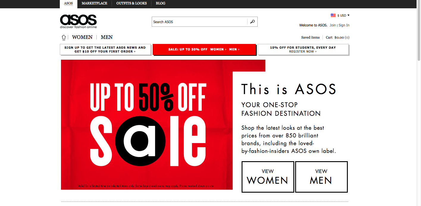
The website I chose was Asos, an online fashion store. The website design relies on simplicity and a black/white color scheme, and incorporates gestalt principles.

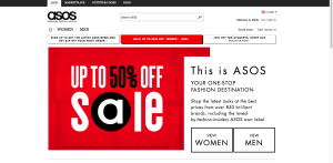
Figure and ground: Asos uses simple black text, which stands out against the white background. Occasionally, white text is placed against a colored background, such as red or white, to make the text pop.

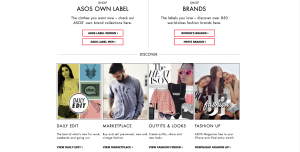
Proximity and alignment: A clean, round sans-serif font is used throughout the website. The typeface is the same as that of the Asos wordmark. All of the text is aligned to the left. Almost all of the type is black against a white background.

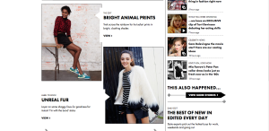
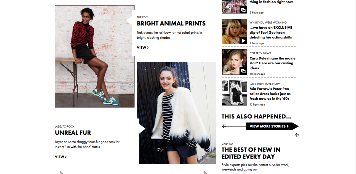
Continuation: Two drop down menus (“women” and “men”) display different types of clothing that people can shop for. Also, news is placed in a sidebar down the right side of the home page, and also in a horizontal box along the bottom of the page. The viewer of the website can scroll down to access more content.

Visual hierarchy: The headlines are bolded and capitalized, which shows dominance over the body text, which uses a lighter weight and a mix of caps/lower case letters. Although most of the website uses black text over a white background, important content uses white text over a red or colored background. Also, key information is much larger on the page.­­­


Gestalt: Walt Disney World

Screen shot 2013-10-11 at 11.58.22 AM


Figure and Ground: The Disney World website establishes differences between the blue background and the links for Disney Princesses, special events, etc. It makes the links stand out by giving them a vivid picture surrounded by a white background that makes it pop. The links at the top also stand out against the white background.

Proximity and alignment: The same font and color is used throughout the entire website. It is mainly a white background with blue accents to stick to Disney’s main colors usually displayed in their logo. The font also comes in many different forms. As seen on this page, it has a bold type and a light or regular type.

Continuation: The headers on the top of the page consist of drop down menus with many different options. The links in the middle of the page also suggest a drop down menu as they have a downward arrow positioned next to them.

Visual Hierarchy: On this page, the designer uses the images to create visual hierarchy and distinguish which links are more important than others. They also include the white boarders around the “All Parks & Resorts” link against the blue background to reiterate which links are more important on the page.

Gestalt

Screen Shot 2013-10-10 at 11.30.55 AM


The website I chose is: http://janfinnesand.com/project/oslo-artistformidling. This website caught my eye because of the clean design without having a lot of white space.

Figure and Background: The background on the home page shown above is technically non-existent. Instead, all of the menu items make up the background. When you roll over one of the boxes with your mouse to select it, it turns to full color, like the middle box in the image above. When the one box is highlighted, then it is very clear that this object is standing out and the rest of the boxes that are in grayscale become the background.

Proximity and Alignment/Continuation: The alignment used in this website is very precise. All of the boxes are aligned in a grid on the page to help the user navigate the website. When one of the items are clicked on, the new page shows this menu bar:

Screen Shot 2013-10-10 at 11.45.05 AM

The design of the menu bar helps create unity within the site. Also, when you roll over the above home menu bar, another one scrolls down:

Screen Shot 2013-10-10 at 11.46.38 AM


The repetition of the strong alignment and color scheme help make the website distinct.

Visual Hierarchy: In this website, the colors drive the visual hierarchy. Because all of the boxes are the same size, the website relies on the colors changing when a user rolls over the item to guide the user around the page.