
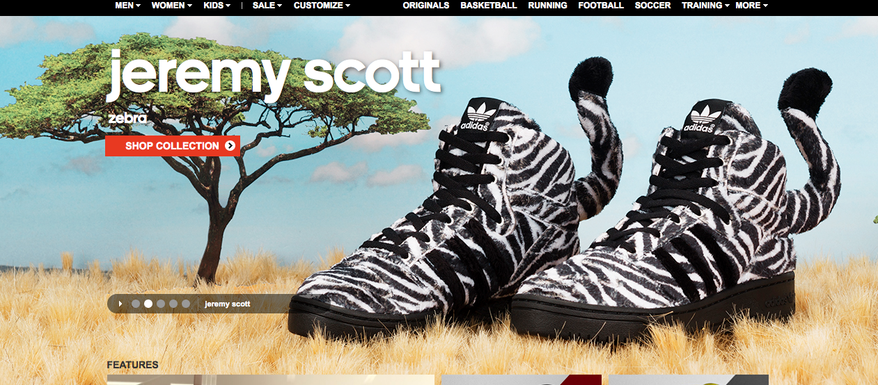
- figure and ground: The zerbra style shoes work both in tandem with the backround while seperating itself from it with the contrasting colors. The backround is displayed as soft earthy colors of the sahara while the vibrant black and white stripes help the shoes to stand out.
- proximity and alignment: The same font to advertise the shoes is used in the adiadas logo. They are the same lower case typeface and it makes for them to really work well together
- continuation: The layout of the entire page looks like animals on a safari. The shoes are zebras and look as if they are just standing in the grass with some of it even surrounding the sole of the shoe.
- visual hierarchy: The stripes of a zebras make them stand out in the wild and the same rule applies to these shoes. they make the shoes the largest thing in the screen compared to a tree in the background to help them stand out. The shoes take up most of the space of the screen.


This website definitely follows the Gestalt principles. I’m initially drawn to the zebra shoes, however next my eyes go to the contrast between the blue sky, the yellowy grass, and the green of the tree.
This website uses the gestalt principals effectively. My eyes are drawn to the product, which is the zebra shoes. My eyes then go to the name of the site and the tabs that are in the same color. I think this website does a good job of guiding the viewer to the important aspects of the site by using gestalt principals.