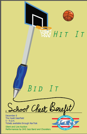
I really love this poster. I think the concept of the basketball hoop/pen is so creative and I like how the “School Chest Benefit” is written on a line like you’d write your name on. However, the only thing you may want to consider for your redo is possibly re-doing the cursive writing because it is a bit messy, but it definitely gets the job done.
I agree that you might think more about the header’s typeface. It seems a little bit confusing and doesn’t serve the readability very well. Generally speaking, the poster is very lovely and serves the main theme very well. You did a great job of use of illustrator and create wonderful images.