
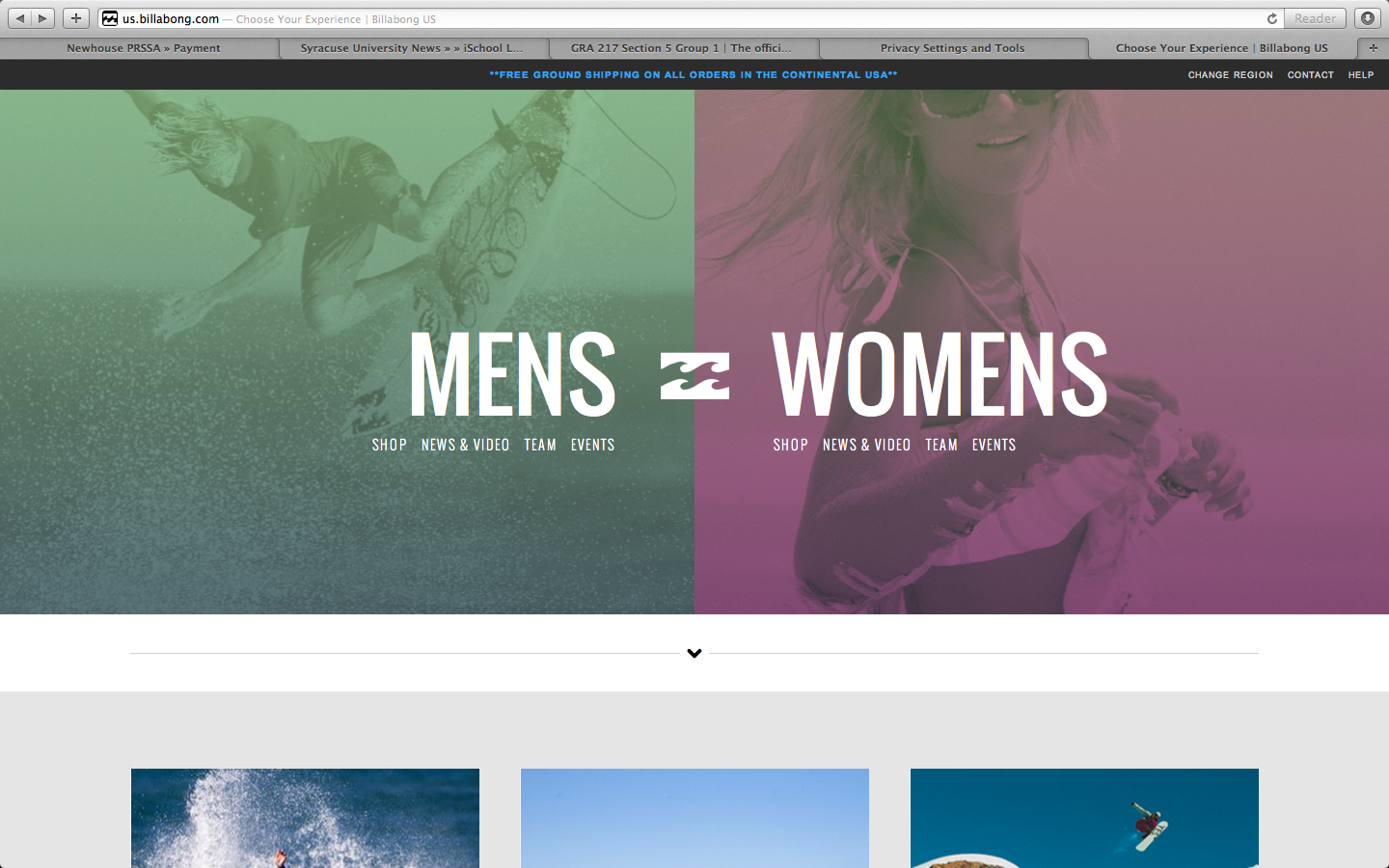
The apparel website Billabong shows the qualities of the gestalt principles, and how the site is organized with visual elements.
- figure and ground: The image in the background makes the text in the foreground stand out. The background is muted colored images, providing a strong contrast with the bold white text over it.
- proximity and alignment: The same font, color, and alignment are used to create unity. This sans serif all caps text creates cohesiveness, and isn’t overwhelming because it is a simple font.
- continuation: The line of larger text, also in line with the logo, creates the first line for the eye to follow. The line of text underneath, in the smaller font, provides a second line to follow.
- visual hierarchy: The two lines as stated previously show readers the order of what is important. The larger words, MENS and WOMENS, show the main categories that the website is organized by. Underneath these words, in the smaller font, show the subcategories of the words in larger font. These provide a breakdown to follow after you have decided to focus on the MENS or WOMENS category.


I think the white text really stands out in the middle of the page because it attracts the eye of the reader as it lays against the green and purple colors. Furthermore, I enjoy the use of the same type throughout the entire page. It gives the page consistency and allows for an easy read.
I like the color choices on this page. The dark faded green and purple contrast sharply but it looks pretty cool. You are right about how this contrast helps to pick up the text and make it more prominent on the page. While there is not a lot to look at on this page the continuation factor is strong. Every individual component of the page including color text typeface and images work together to provide a natural, sleek and cool look.