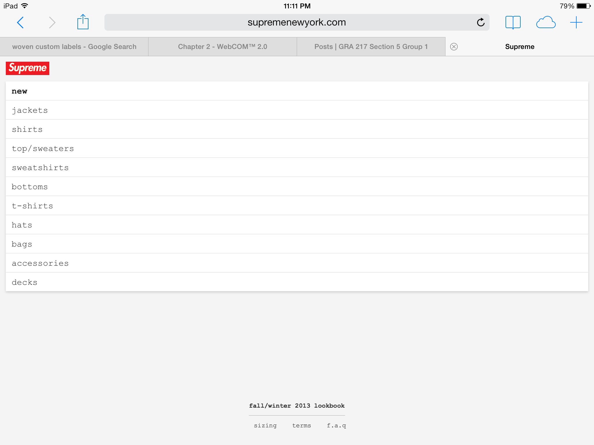
The Supreme online store uses a great deal of the gestalt strategy to attract the eye of the viewer; for instance the use of Visual Hierarchy is apparent in the placement of the brand over the main menu, as the brand is bolded and surrounded by red. The rest of the menu uses a plain black, san serif font indefinitely separating the menu from the brand logo. The use of figure (logo) to the white background also creates a sense of attraction from the viewers eye to the text.


The red color of the Supreme logo sticks out on the white background so that the reader’s eye goes directly towards it. It uses multiple different type faces, which makes it slightly difficult to read because of the lack of consistency. Lastly, the all white background is a little to plain and may lose the viewer’s interest.