
Throughout this semester, I have struggled with almost everything Adobe has to offer. Finally, I can say that I feel confident in myself in using Photoshop, InDesign and Illustrator. Every TA was always there to help me learn and Professor Taylor’s daily office hours were a life saver. Essentially, what I have learned this semester is to appreciate all of the designs and advertisements I see in the world because they all most likely took days and even months to create an idea and then execute it properly.
Category Archives: week8post
Concluding Thoughts
Coming into the class I did not have more than an elementary knowledge of graphic design and the softwares involved. After learning about the powerful ways in which the principles of design affect all aspects of life, I now recognize the value and worth in being able to manipulate public perception through the use of design tools and techniques. Prior to this class, I did not analyze and understand graphic design in the same way that I do now as I now am able to make the best use out of design principles and tools such as kerning and leading. Also, I now blame this class for how I will never be able to look at text the same way–now type is more than type. Now I find myself looking at typefaces and am able to recognize whether it is a serif, sans-serif, or another possible typeface. Counters, kerning, x-heights, margins, the rule of thirds, complimentary and analogous colors–forever stuck in my head thanks to this class!
iPad Cover
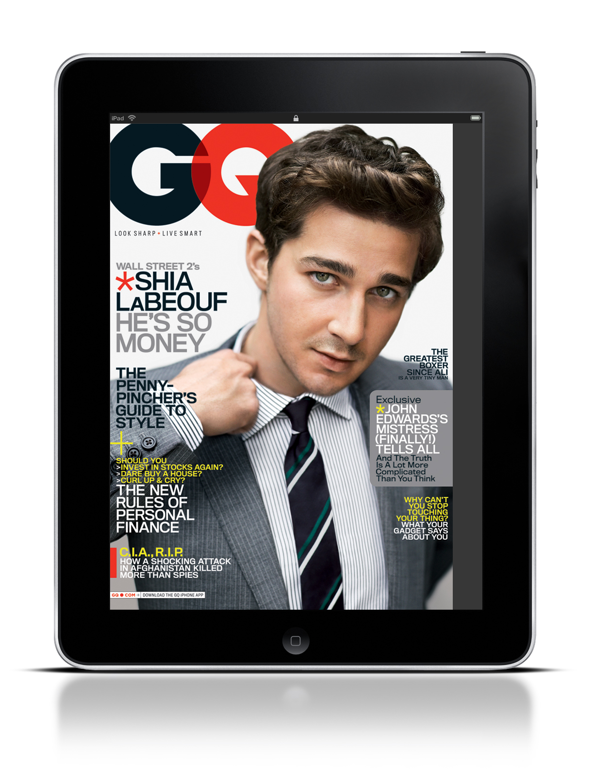
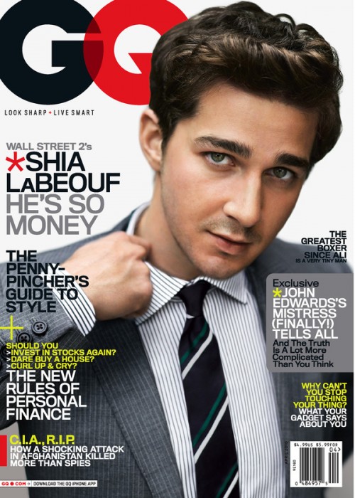
The iPad and GQ magazine use this photo for several reasons. First, the GQ logo leads directly into Shia LaBeouf. As the reader’s eye’s move to the left, they instantly grab the headline and subsequently move down the page, reading each section of text. In addition, Shia’s hand leads directly into another blurb of text. Truthfully, there is no major difference between the iPad and the actual magazine. The only argument for potential difference is that the image may be slightly cropped on the iPad screen.
Magazine Cover

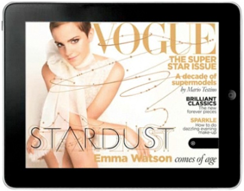
I chose this specific magazine cover because I felt that the designer kept design principles in mind when shooting the photo. The image works both horizontally and vertically in my opinion because the overall image is kept the same, and does not look distorted in the horizontal version. I also liked how the designer used the rule of thirds when creating the horizontal version. I favor the horizontal version because it is less cluttered. I like how type isn’t placed over Emma Watson as much as it is in the vertical version. I also am captivated by the extension of the typography that weaves and winds over the cover. It brings Emma’s potrait in contact with the type, and unifies them which gives the cover an overall more connected feeling.
Headline and deck
 This headline and deck work well together because the headline tells of who the article is featuring and what they are focusing on. Then the deck compliments and furthers this, describing more specifics and who will be interviewing the subject, Kate Winslet.
Headline and Deck
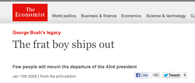
This is a feature story on Economist magazine about Bush leaving the White House. The magazine teased the lack of popularity of Bush’s presidency in the United States. Economist also teased Bush’s poor policy-makings.
Head and Deck
Headline: Miley Goes Bang
Deck: With her devil-may-care attitude and rocking new sound, the pop star proves she still can’t be tamed. By Derek Blasberg.
I think this head and deck are very clever because they refer to two pieces of her music (her new album Bangerz and her old song “Can’t Be Tamed”). The deck also successfully introduces you to the topic they will be discussing in the story.
(From Harper’s Bazaar, October 2013)
Magazine Headline and Deck

I like the headline because it is simple enough to get the point across and will come up in a search when using a variety of words. I was particularly drawn to the deck though because of the way it used questions to make you want to read the article.
Magazine Spread Design
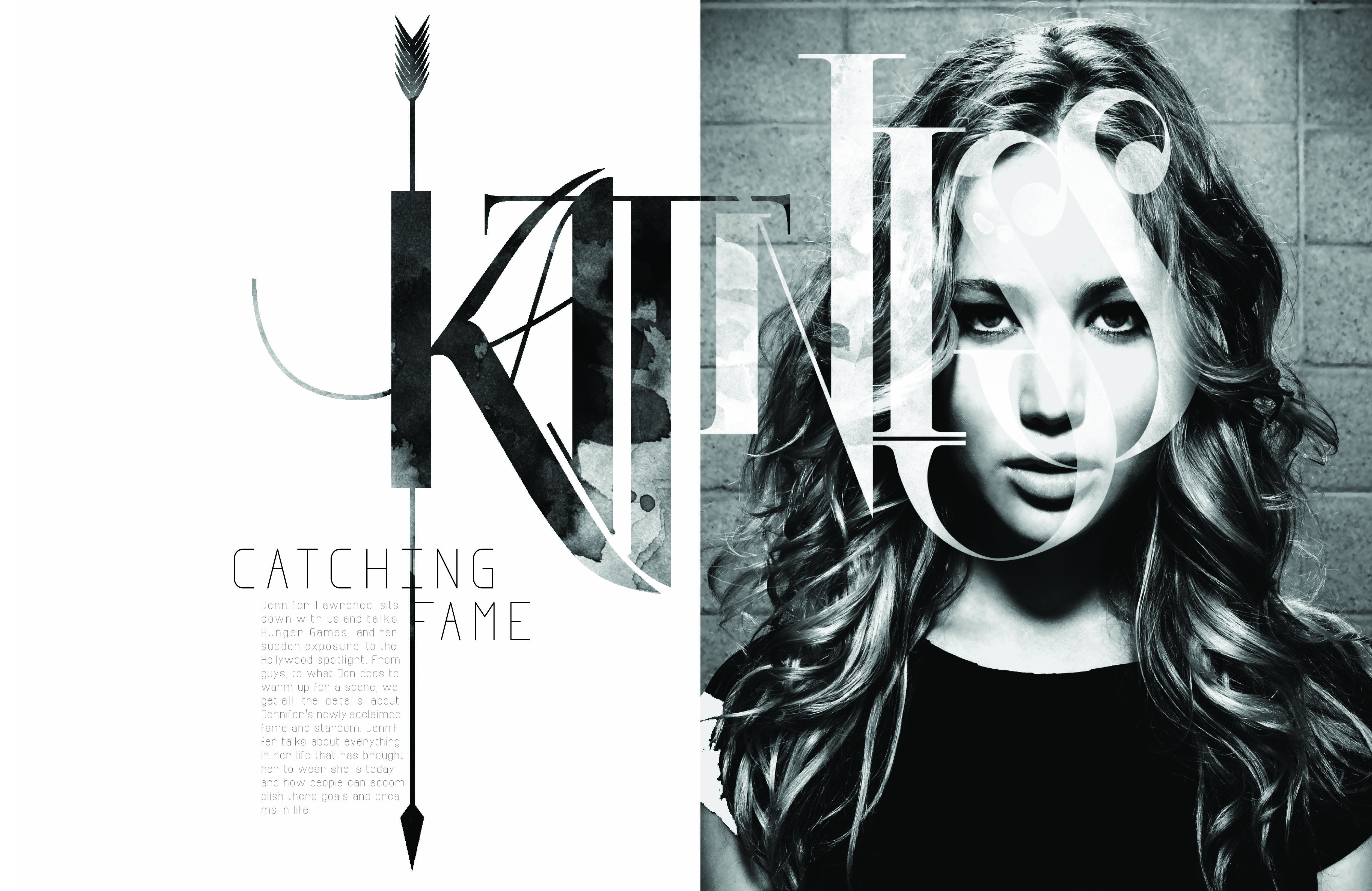
I really love this two page spread, and not just because I love the Hunger Games. Although this design shows no color, it is far from plain and simple. The typeface used for “Katniss” is extremely creative. The designer also incorporated a different picture within the typeface to contrast from the picture of Jennifer Lawrence. The texture seems to be either dirt or blood stained, sticking to the theme of the movie. The arrow going through the K also fits perfectly with the theme of the written piece (which is about Jennifer’s role in the movie) because it is one of the main sources of survival for Katniss. The designer further perfected this design by making the arrow go through the K in Katniss, the I in Catching and the F in Fame. Not to mention that Jennifer Lawrence looks absolutely beautiful.
Magazine Spread
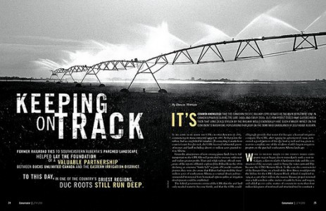
I am really drawn to two page magazine spreads that have a continuation of a picture from page to page. With magazines, people often pick them up and flip through them rather quickly if they are bored, or waiting for something. I like the idea of having two page spreads in magazines because I feel like they break up the monotony of the average magazine article.
I specifically chose this spread because I was really drawn to the way it has the ability to grab the reader’s attention without using color. The photo itself is stunning, and the contrast between the light and dark parts of the image work extremely well together. I also liked the fact that the photo contained a vanishing point. It gives the photo depth and dimensionality rather than just shooting the sprinkler system head on. I was also drawn to the placement of the type and how it did not interfere with the photograph, but aided in getting the message across.