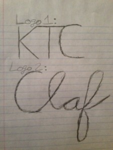
My thought process behind my logos were that I wanted them to be simple, yet grab attention. In my first logo, I made it similar to the fast food chain KFC because I thought people would look at the logo, realize it is not KFC and be curious to see what this new brand is. The three letters stand for the initials of my name and I connected them all to create fluid motion between letters.
For my second logo, I cut my last name in half and drew it in cursive. The cursive font gives the logo a level of elegance and high quality. It is short and sweet and depicts myself in a manner that would impress others.


Your second logo is definitely my favorite. I find it interesting that you shortened your last name because you don’t see that very often.
I prefer the second logo over the first, simply because it is unique; using your inital logo would definitely catch the attention of the viewer at first glance, but upon realizing it isn’t what they think it is you will lose their attention.