
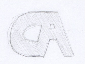
At first I came up with this generic logo, but I didn’t like it because it had no character and seemed like a boring micro processing company logo. Then I came up with this….
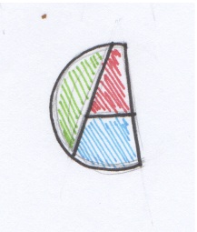
There were many different drafts of my logo before I finally came to this one. I tried to incorporate the A of my last name into the C of my first name and I came up with this cool, colorful, and fun shape. I plan to make this on illustrator and incorporate it into future projects or business cards.


Definitely fully agree with the first one looking a little generic/not having a lot of character. The second one has personality and is a new and interesting way to look at the original logo. It also reminds me of a sun or moon because of the half circle shape. It’s an easy one to remember and is effective.
I really like your second logo! The C and the A are combined in a very different and unique way. It draws people’s attention as they try to figure out what it means, and then people will easily remember it. I also like how you incorporated three different colors, which creates a sense of balance and separation even though the design works as a whole. Like Sarah, I also thought of the moon when looking at the logo. I agree that the first logo looks like a company logo, and it also looks kind of industrial.