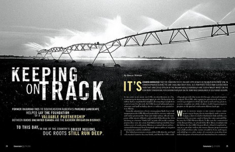
I am really drawn to two page magazine spreads that have a continuation of a picture from page to page. With magazines, people often pick them up and flip through them rather quickly if they are bored, or waiting for something. I like the idea of having two page spreads in magazines because I feel like they break up the monotony of the average magazine article.
I specifically chose this spread because I was really drawn to the way it has the ability to grab the reader’s attention without using color. The photo itself is stunning, and the contrast between the light and dark parts of the image work extremely well together. I also liked the fact that the photo contained a vanishing point. It gives the photo depth and dimensionality rather than just shooting the sprinkler system head on. I was also drawn to the placement of the type and how it did not interfere with the photograph, but aided in getting the message across.


I also really like magazine spreads that have a continuation of a picture spread on two pages. I think the way the designer used color is very effective, my eye is immediately drawn to the text in color, which I assume was the purpose. Using different text sizes also accomplished visual guiding on this layout.