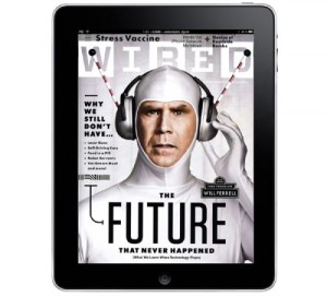
The type on this magazine is very readable and modern. I love how they stayed with with black and white. It lends the cover to be very simple and allows will ferrel to really be the focal point of the cover. Also there is relatively very little content on the page. Furthermore, compared to regular magazine covers there isn’t that much type.
GRA 217 Section 5 Group 1
The official blog for GRA 217 with Sherri Taylor


Although it is extremely awkward that this iPad cover was already used by another classmate this week, I find this cover extremely interesting. The dominant color of gray provides that ominous feeling of the future and high technology. Also, Will Ferrell is the man and kills it with the expression on his face.