
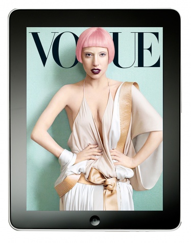
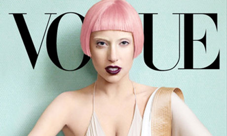
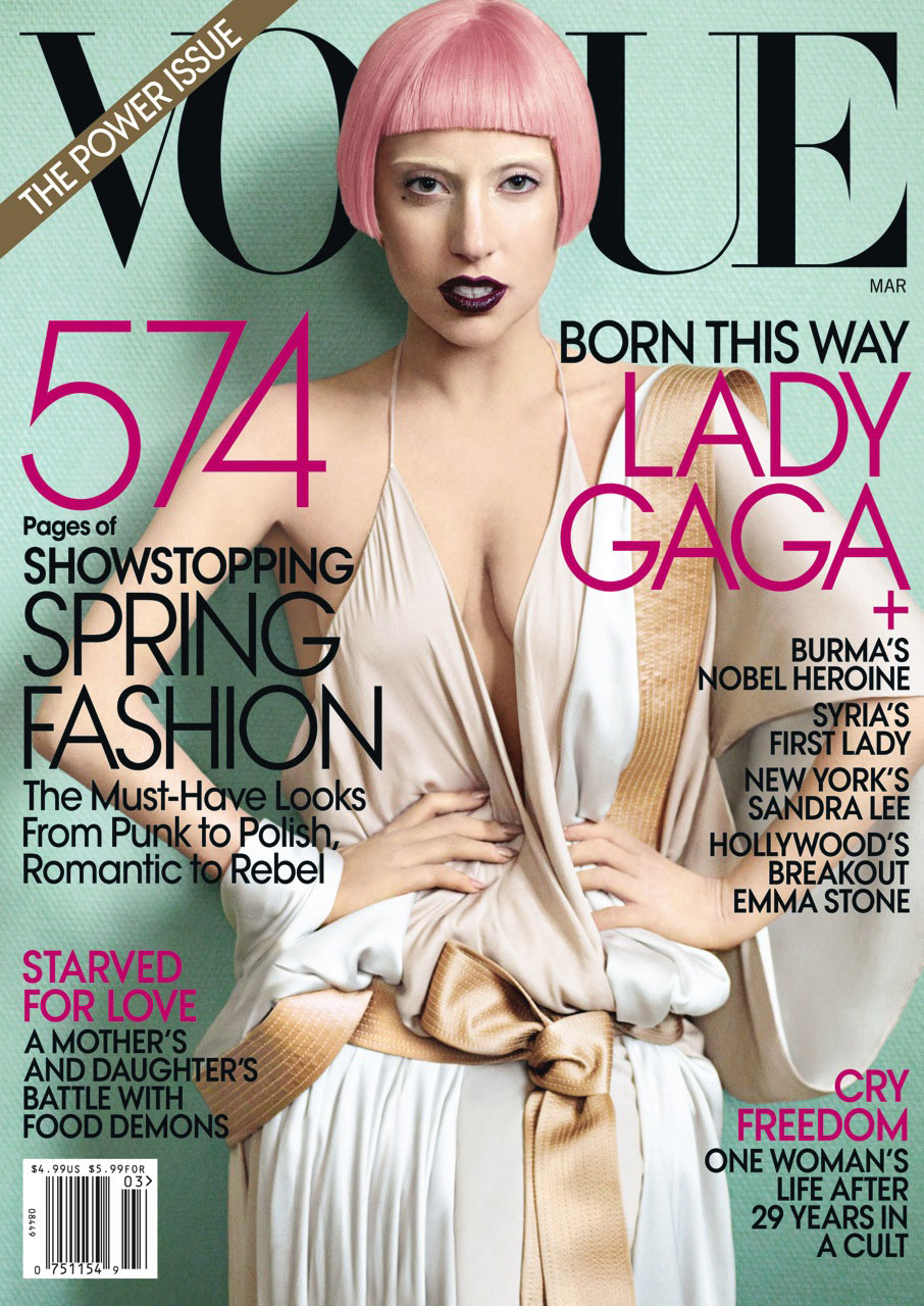
I chose an issue of Vogue with Lady Gaga on the cover for my iPad magazine design. As you can see, the iPad versions of the cover are significantly different than the print cover. The iPad covers are simple with no cover lines – only the magazine name and the image of Lady Gaga are displayed. I think the cover of the print edition looks way more crowded and less appealing due to all of the cover lines, plus the bar code and “The Power Issue” banner. The Lady Gaga image works well both horizontally and vertically. For the horizontal, the designer simply cropped Lady Gaga at her chest so the focus is solely on her head instead of her whole body. With the image cropped so closely, it looks balanced and clean in the middle of the horizontal iPad cover, and there is no need to fill extra white space. The image also works well because Lady Gaga’s head takes the place of the “G” in Vogue. Her shadow makes the cover look dimensional and interesting instead of flat.


The decision to NOT use a lot of white space really works with both the magazine, and the iPad cover. The model fills the space perfectly, and I love how clean the iPad cover looks without the text. The background color is soft, allowing both the dark text to really pop out, which also works great as both a print and digital publication. Also, even though the “G” in vogue is removed, Lady Gaga’s head fits the area appropriately, especially considering “Gaga” starts with the letter “g.”
These iPad magazine covers are really effective in that they really focus on the focal point more than anything else. While most designers would apply some sort of text to enhance the image and make use of the white space, the designer is really relying on the skill of the photographer to attract the eye of the viewer. A risky, but useful strategy if executed correctly.