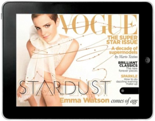
I chose this specific magazine cover because I felt that the designer kept design principles in mind when shooting the photo. The image works both horizontally and vertically in my opinion because the overall image is kept the same, and does not look distorted in the horizontal version. I also liked how the designer used the rule of thirds when creating the horizontal version. I favor the horizontal version because it is less cluttered. I like how type isn’t placed over Emma Watson as much as it is in the vertical version. I also am captivated by the extension of the typography that weaves and winds over the cover. It brings Emma’s potrait in contact with the type, and unifies them which gives the cover an overall more connected feeling.
GRA 217 Section 5 Group 1
The official blog for GRA 217 with Sherri Taylor


I really like the example you chose because it shows a very successful way to arrange the same picture both vertically and horizontally. Although I think the vertical version looks more like a typical magazine I really like how clean the horizontal version looks. I also think it’s interesting that they chose to omit content for the horizontal one.
The contrast between the horizontal and vertical version is great. Removing the text from around Watson keeps the focus on her and the quality of her image. The tone that they set with the image is carried throughout the whole cover with the colors and typeface used. It also looks like there might be a pull tab underneath the text on the right side of the iPad version. This is a great way to make people comfortable with the iPad version and still advertise what else is in the magazine without putting it all on the cover.
What really attracts me to this iPad magazine cover is the color scheme and how well it matches with Emma Watson’s hair and outfit. The color scheme complements the focal point and thus makes it easier to bring the readers eye around the cover page. Since its easy on the eyes of the reader, its also makes it more welcoming to the reader to continue reading into the article.