

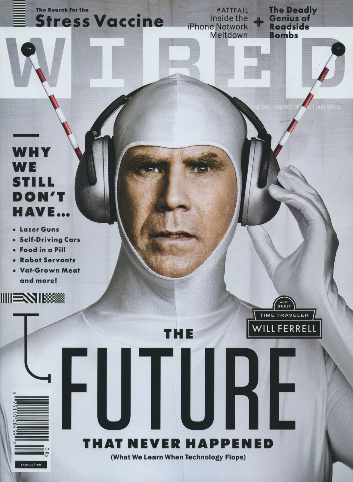
I couldn’t find the horizontal layout for this Wired cover that features Will Ferrell. But I did find the print version, which, as you can see, is identical except for the newsstand barcode. The consistent white-silver color scheme is very effective in this photo illustration since silver represents technology and the future. Ferrell’s headphones point upwards, directing the eye to the WIRED nameplate. Since sans serif is considered more modern than serif typefaces, the elongated font also fits well with the cover story. This issue has more cover lines than you would normally see on an iPad issue, so it surprises me that they kept all of them between the print and digital versions.


I also find it interesting that they chose to keep all the cover lines from the print version to the digital one. For this particular issue I feel like it works though because there is still quite a bit of white space. I also agree that the color scheme is very effective for the issue. I am curious if this particular issue has a horizontal version because it would be interesting to see how the designer cut the photo and arranged the text around it. I don’t think that this photo would be as visually strong horizontal.
This translated very well from print to digital design. The color scheme is very effective for both of these designs, but of course the iPad design’s is more eyecatching because of the resolution of the screen. I think if the photo was cropped, we’d probably just see his head, and I don’t think the cover and visual would be very effective.