I have learned so much this semester in this class. Before, I had no conceptual understanding what so ever on how images were designed, and why some visuals are more effective than others. Walking down the street I now, have a better understanding when I look at posters, signs, logos, etc. as to why they are designed the way they are. I now can see how typography plays an important role in design, and the smallest change to a font can make a big differnece in the overall design. I now have a greater appreciation for all graphic designers, and all the minute details they consider when creating visuals. While I am glad I was able to be expoed to the graphic design process it is safe to say, I will leave it to the professionals in the future.
Author Archives: Stephanie Diacovo
iPad Magazine
Courtney Inbody, Holly Johnston, Michael Clavijo, Stephanie Diacovo
 1. Old Style Serif type in signage
 2. Modern serif type in signage
 3. Script or cursive type in signage
 4. Slab serif type in signage
 5. Pictographic logo
 6. An effective logo
 7. Silhouette in logo form
 8. An analogous use of color
 9. Complementary color use
 10. Color repetition from visual to type
 11. Isomorphic correspondence in visual use
 12. Path or continuation in visual use
 13. Word emphasized in type size in a headline display
 14. Word emphasized in color in a type display
 15. Good poster design
 16. Picture using rule of thirds (top picture)
 17. Use of a picture showing a leading line
 18. Use of a picture showing stopped action
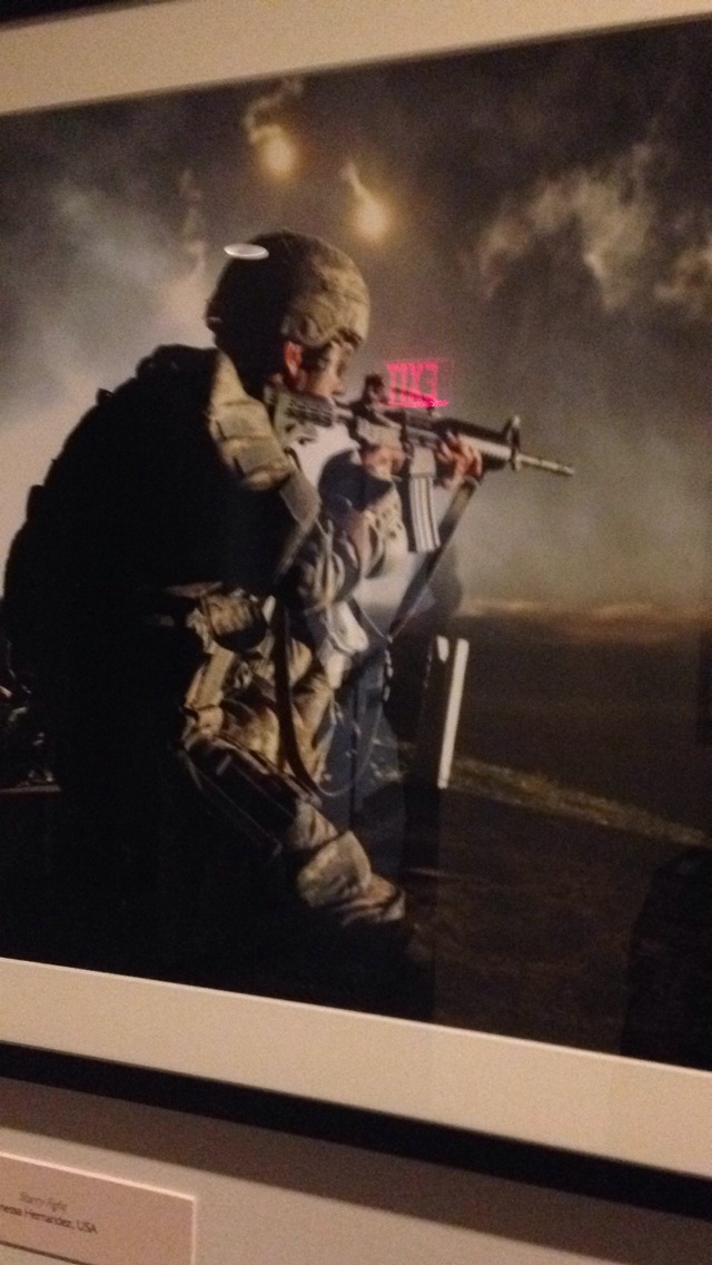 19. Environmental portrait
 20. Something in nature that looks like a letter
Magazine Cover

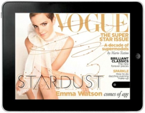
I chose this specific magazine cover because I felt that the designer kept design principles in mind when shooting the photo. The image works both horizontally and vertically in my opinion because the overall image is kept the same, and does not look distorted in the horizontal version. I also liked how the designer used the rule of thirds when creating the horizontal version. I favor the horizontal version because it is less cluttered. I like how type isn’t placed over Emma Watson as much as it is in the vertical version. I also am captivated by the extension of the typography that weaves and winds over the cover. It brings Emma’s potrait in contact with the type, and unifies them which gives the cover an overall more connected feeling.
Magazine Headline and Deck

I like the headline because it is simple enough to get the point across and will come up in a search when using a variety of words. I was particularly drawn to the deck though because of the way it used questions to make you want to read the article.
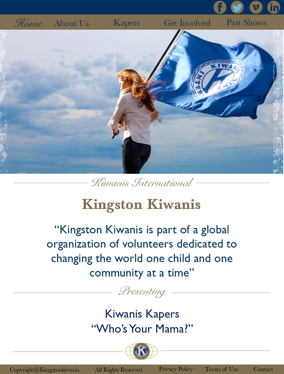
Interface Design


Magazine Spread
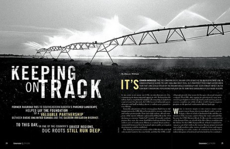
I am really drawn to two page magazine spreads that have a continuation of a picture from page to page. With magazines, people often pick them up and flip through them rather quickly if they are bored, or waiting for something. I like the idea of having two page spreads in magazines because I feel like they break up the monotony of the average magazine article.
I specifically chose this spread because I was really drawn to the way it has the ability to grab the reader’s attention without using color. The photo itself is stunning, and the contrast between the light and dark parts of the image work extremely well together. I also liked the fact that the photo contained a vanishing point. It gives the photo depth and dimensionality rather than just shooting the sprinkler system head on. I was also drawn to the placement of the type and how it did not interfere with the photograph, but aided in getting the message across.
Website Photography
 I chose spalding as a representation of a website with good photography because there home page caught my attention with all of the differnet pictures that it displayed. The photograph above is one in a set of images that rotate on the home page. I took a screen shot of this image in particular because I feel like it grabs the viewers attention from the start. The concrast between the man’s body and the background gives the image an over all feeling of accomplishment. It makes it seem as if the man is workign really hard to achieve some aspect of physical fitness. The light highlights his athletic features which is what spalding is about. The photograph effectively communicates to the viewers that Spalding is an athletic company, and targets viewers who are into physical fitness or sports. I feel like the designer chose this image because it is general enough to make the viewer understand the object of the website, but not so specific that the viewer may think the website is for a specific sport. The picture adds depth to the website’s overall design by giving it a casual/determined tone which is what the target audience is looking for.
Gestalt Design
 I chose this website to represent gestalt design because of its simplicity. While there are no pictures or colors to represent similarity, the idea of size and font brings the website together as a whole. The main font creates similarity by size, but also by shape. While “Life” and “Sam” are directly related by font size, the “according to” also can be grouped along with them due to shape of the font. All of the symbols at the bottom also relate well to the rest of the webite not only because they are the same color, but becuase they are geometrically placed in the middle of the page like the rest of the font. The symbols work together as a group themselves but also relate to the rest of the webpage.
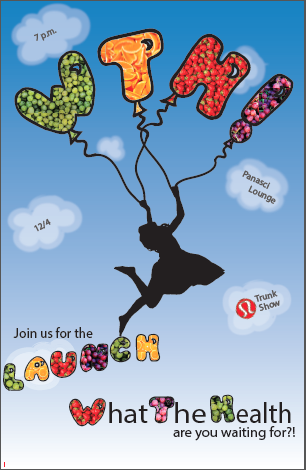
Poster