
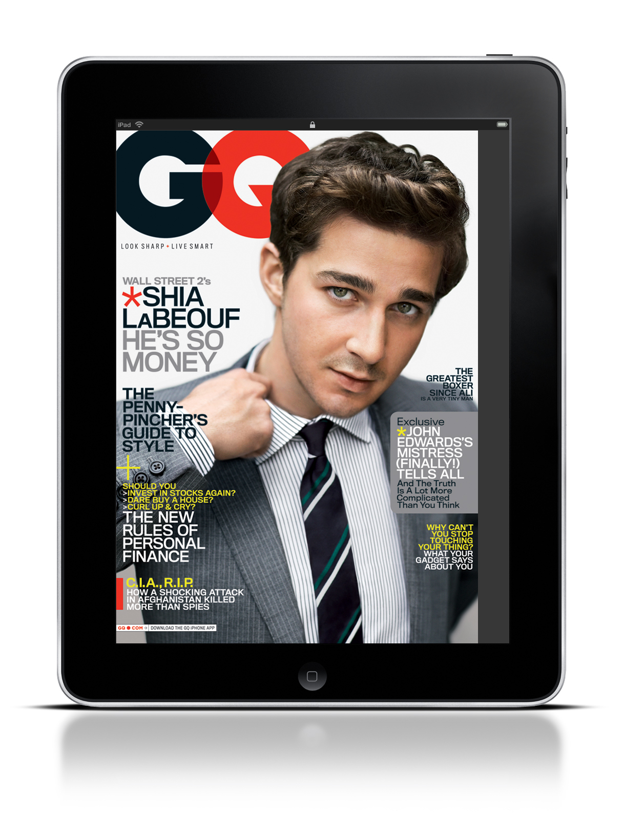
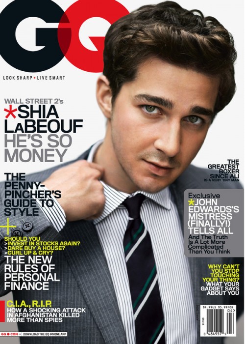
The iPad and GQ magazine use this photo for several reasons. First, the GQ logo leads directly into Shia LaBeouf. As the reader’s eye’s move to the left, they instantly grab the headline and subsequently move down the page, reading each section of text. In addition, Shia’s hand leads directly into another blurb of text. Truthfully, there is no major difference between the iPad and the actual magazine. The only argument for potential difference is that the image may be slightly cropped on the iPad screen.


Using Shia LaBeouf to fill almost the entire space on the cover of both the iPad and print magazine is very effective. I also completely agree with the GQ logo leading to Shia LaBeouf and the associated headline which directs the readers eye towards the most important content on the page. The photo is strong, and the facial expression is pretty funny, so all in all I would say it’s an extremely effective cover, in both iPad and print publication.
This magazine cover is balanced and appealing. Since Shia LaBeouf is leaning toward the right, the designer placed the majority of the text on the left, creating balance and leading the eye from the top left. The GQ name really does lead to the image of Shia LeBeouf, and I think the placement and crop of the image is effective. Shia creates interest but doesn’t detract from the cover lines. Although there are many cover lines, the design doesn’t look too crowded because each cover line is a different weight and color. In other words, the cover lines are grouped and separated. The iPad design is almost the same as the print design, but I think this works because the cover is still effective and nicely organized.