


During this project, it was definitely good to learn about the interactivity feature of InDesign and know that those features are there. I also learned a lot more about InDesign and the tools that it has by doing the resume and this project in that program.


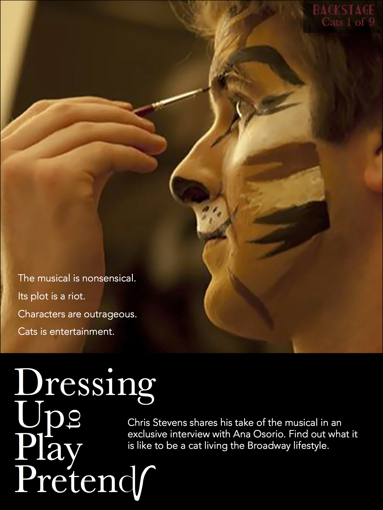
I really like your opening page. The performer is looking to the left, which directs the eye to the hed. I also thought it was very clever that you included “scratch here” for the interactivity direction. The typeface for your cover definitely fits as well (is it called Broadway?). However, I think you might be missing a cover line that was supposed to hyperlink to your story.
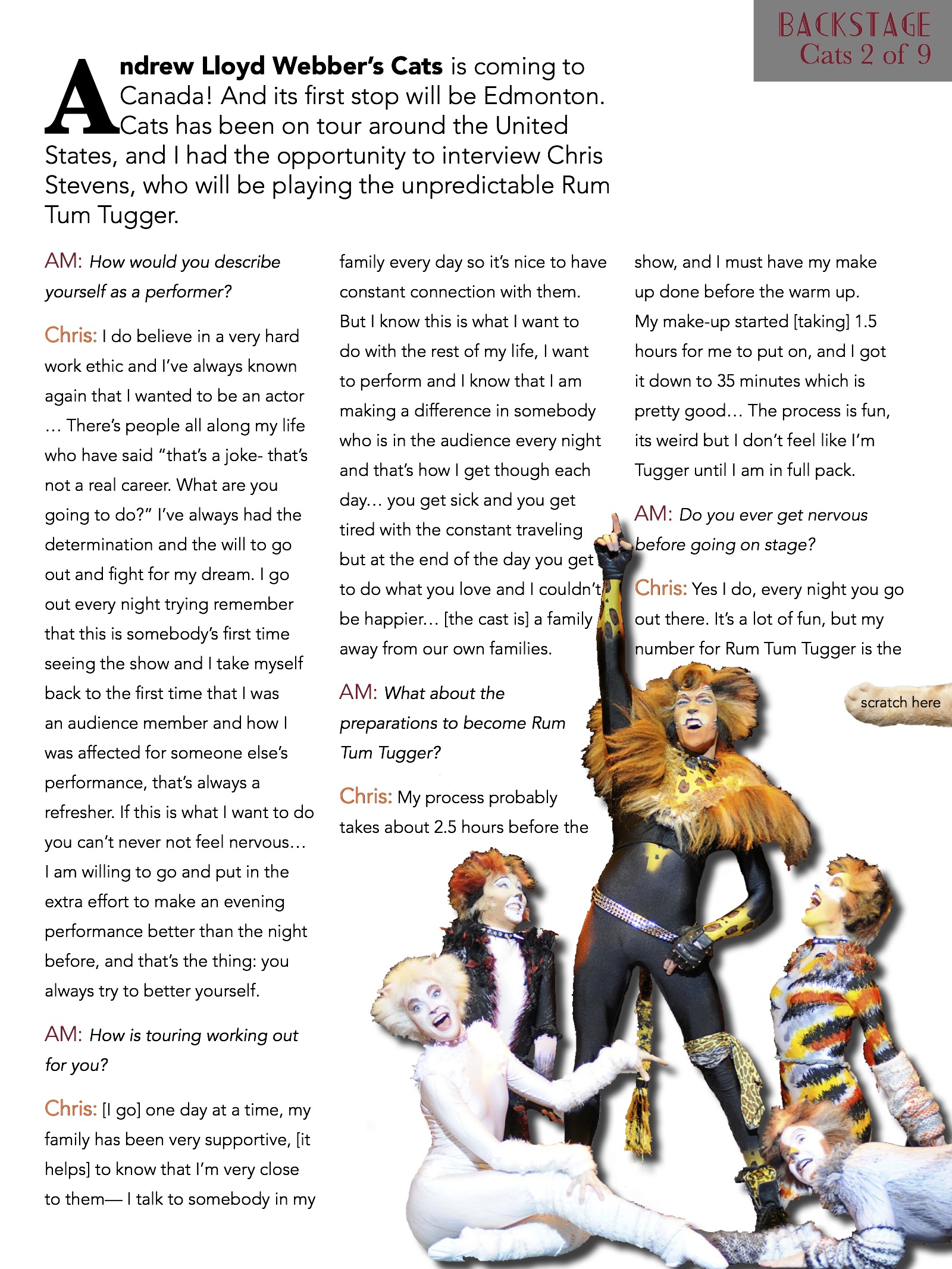
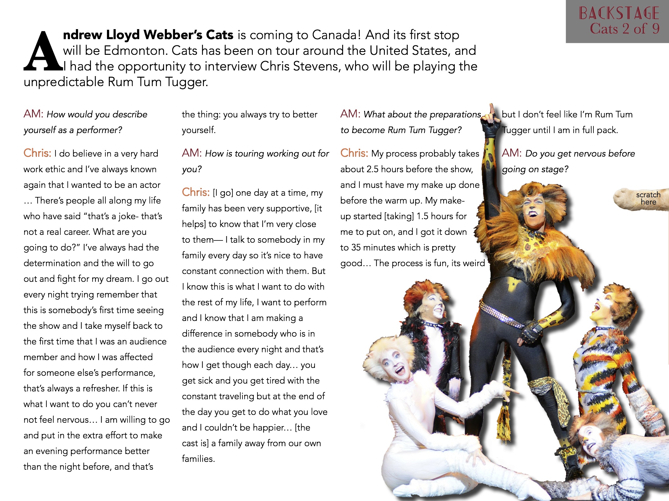
I love your visuals! they’re so strong and engaging. I also feel like they fit perfectly with the personality of your magazine. I really like the font that you use for your headers but I think I think the header on your second page is a little hard to read with the to being written vertically rather than horizontally.