

Instagram ditched their old stock font wordmark for a more refined custom-drawn one. The new wordmark stays true to Instragram’s brand but looks cleaner and less choppy. The original typeface was script, but did not connect throughout the name. The new wordmark encourages the eye to flow effortlessly through the name. The old typeface “Billabong” gave the brand a retro feel, which carries over into the new wordmark so that the brand’s personality is not lost. The old I in Instagram could be confused for a G, but the new one is clearly an I without loosing character. Using blue also enhances the brands wordmark because it is easier on the eye and also can change appearances using Instragram’s different filters. The old wordmark looked the same in each filter, which did not represent the company’s concept of representing the same image in different ways.
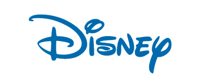
The Disney wordmark represents The Walt Disney Company perfectly. The typeface gives the wordmark a whimsical feel and the choice to mix both upper case and lower case letters makes it feel fun and friendly. Making the D the longest and widest letter draws your eye to the start of the wordmark first. The I’s dot gives it a playful feeling and resembles Walt Disney’s real signature I. The curve of the S brings your eye in the direction of the N, which is tilted in the opposite direction of the following E, again reestablishing the companies playful feel. The Y at the end ties into the signature feeling of the entire wordmark making it feel personal. The thickness, lettercase, whitespace, and color all add to the feel of childhood and imagination, which is what Disney is all about.


These word marks definitely help define the image and character of the company they represent. While instagram updated theirs to show they are staying relevant, Disney as the classic whimsical lettering that has been famous for years.