 This wordmark is entertaining because it first captures your attention with the classic bright red color. The all capitals create a powerful look, but keeping it simple with the plain text. The O is a play on the word morningstar, meaning the sun, and it is rising from the bottom of the word line like the sun would rise in the morning. The alteration of the shape of the O also adds to the sun reference. While being simple it is a creative word mark.
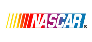
 This iconic wordmark is very identifiable. First off, the slant of the letters gives you the feeling of motion, which represents the cars of Nascar. The overlay of the text on the colored stripes show the motion by a transition of color, and transitional color makes your eye move across it giving more motion to the wordmark. Also the different widths of the stripes help your eye start from the left and move right. In addition, the kerning between the letters varies, and connecting some of the letters gives more fluidity. This all gives speed to the wordmark.


I find the Nascar wordmark very interesting. I get a sense of motion from the color changes, the slant of the font and the yellow stripes before the type, all of which make the eye move easily across the wordmark. Also, the varying colors represent the excitement and energy of a Nascar race, and the bold letters draw attention to the Nascar name over the colors.