
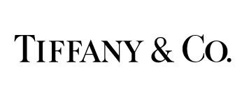
The wordmark for Tiffany & Co. represents the high-end jewelry store very nicely. The large serifs and thin letters make the typeface look formal and proper, which signifies the elegance and class of the items in the store. The plain black type, simple letters and uniform kerning between letters also show how the merchandise at Tiffany’s is classic and traditional. Every letter is a capital letter, which draws attention, but the “T” and “C” rise above the others to create a bit of separation.

The wordmark for Little Tikes is very colorful and bold. Since the company manufactures young children’s toys, and since the word “little” is part of its name, all of the letters in the wordmark are lowercase. Red and blue are colors often associated with children, especially young boys, so it seems fitting that these colors were chosen for the Little Tikes wordmark. The bold and unique letters, especially the letter “e,” also give the wordmark a childish vibe. The tight kerning allows the reader’s eye to skim quickly over the company name and allows both words to easily work together as one name.


The sophisticated all capital look of this font, along with the fairly tight kerning gives this wordmark an upperclass and sophisticated look. The type of font, along with the squared edges give the letter a more formal look, which implies regulation and intellect due to the even formation of the font.
I definitely agree that the font chosen for the Tiffany & Co logo emphasizes the formal and elegant nature of the product. The letters are clean and classic.
The little tikes logo definitely represents the company very well. The red and blue contrast makes the words pop, and the use of all lowercase letters gives off a fun and childish vibe.