The sharpie wordmark is effective because the font looks like stroke of a sharpie marker/pen. The designer also chose to use only black because the traditional sharpie marker was black. The loose cursive writing also makes the word look handwritten. The font that is used is also easy to read and unique so it makes it easier for the consumer to recognize it.
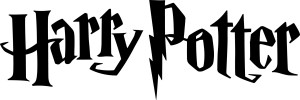
The harry potter wordmark goes along with the aesthetics of the entire movie. The font’s jagged footings make it seem as though it could have been written using a quill, and the “p” has a lightening bolt, just like Harry does. The uneven quality to the letters with the jagged edges also makes the font look spooky.


I agree, I really like how the sharpie wordmark exemplifies the stroke of the actual sharpie, and have smooth and calculated using sharpie markers can be. It’s a fairly sophisticated look, and the smoothness of the stroke suggests a finer quality of work.
I completely agree that the wordmark represents the book series perfectly. The wordmark does give off the spooky sense, which illustrates the fact that the series is not all happy and magical but also very dark and scary. It fits perfectly with everything that the book and movie represent. The seemingly handwritten typeface and lightening bolt “P” bring out the magical sense that the entire series entails.
Because the Sharpie logo is handwritten, it gives it a very down to earth feeling. The makers want their markers to appeal to the masses and make it seem like a useful, everyday tool; and I think this word mark accomplishes that. It has a effortless, scribbled look like the word mark was jotted down on a piece of note paper.
The Harry Potter logo achieves a magical and whimsical feeling. I would consider this typography to appeal more towards a younger demographic like the books, based on the fun jagged edges. It also incorporates a bit of the Harry Potter story in its lettering. The lightening bolt in the “P” matched the one one Harry’s forehead. It’s neat how they added that detail to the word mark.