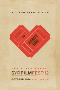
This poster for a local film festival is very clear and straightforward. While the play on words is a little cliche and a little over done (and by a little, I mean a lot) it works with the over message of the poster. The two tickets set together to look like a heart is creative and definitely catches the eye. It ties in with the phrase very well and definitely makes up for the cliche-ness of the whole thing. As far as colors, I like the color scheme and I think that it is very well carried out throughout the entire poster. The red from the tickets is present in about half of the text and the other half of the text is the color of the text on the ticket.
Another thing I really like about this poster is the wordmark. The letters are kerned very tightly but they are differentiated by color and weight of the font.


As already stated in the post above, the red color of the tickets instantly grabs the viewers eyes and the heart shape illuminates the concept of love and family friendly. In addition, the red and black color scheme alternates from left to right in accordance with the path of our eye.
The background of the poster is worn and rustic to promote the classic movie ambiance.
I think this poster, although it is minimalist, is very catchy. For being so simple there’s so many elements to address, just as you did. I think the combination of typefaces that were used work really well together. The play on words is quite cliche, but the loose kerning of the letters does make it very attractive.
I agree with Rosalind. I like simple things, and I think the visuals were used perfectly. The theme of tickets to promote a film festival is both simple and brilliant. Doesn’t require much thought from the viewer as it gets right to the point. I appreciate that in a graphic.