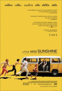
This is the movie poster for Little Miss Sunshine, and I’ve always found it to be really intriguing. First, the bold yellow background ties in perfectly with the movie title and is definitely eye-catching. The picture of the at the bottom of the poster also is very interesting and does a very effective job at catching people’s attention, and does a great job at portraying how the they’re a family “on the verge a breakdown”. I think my favorite part of this poster is the fact that the movie tittle isn’t all the same size. This really helps balance the action going on at the bottom left of the poster and the lack of weight on the bottom right. On this note, the poster designer did a phenomenal job understanding and incorporating the “Z” principle, because my eyes always follow that motion each time I look at the poster. I do find it awkward how heavy the poster is at the bottom, but I think that was intentional since the family in the movie is awkward and dysfunctional. All in all, I find this a very effective poster because not only is it appealing to the eye but it communicates very well, and makes you want to go see the movie.


I feel very similarly about the type size that was chosen for the title on this poster. The title’s changing size really gives the impression of a fast paced, ever-changing movie plot. The picture at the bottom is positioned so as to encourage the rule of thirds, avoiding the center of the poster and thus making it more interesting for the eye to look at. The yellow, or “white space,” that is generously used in this poster also contributes to the focus on the bottom portion of the poster, making it more appealing along with the bright utilization of the color yellow which grabs the attention of any passing viewer.
I have always loved the visual alignment of this poster. You’re right when you say your eyes are directed in a certain way that makes you read the type in order. The color is on the bolder side, but I feel that it works with the type of movie it is advertising. Yellow represents the chaotic mess that is their family’s life.
Me too love this movie poster! I am really fond of the color, bright which fits the title “sunshine” and the happy story as told in the film. You gave very good analysis of the color, title’s fonts and size and how eyes followed the whole picture.