
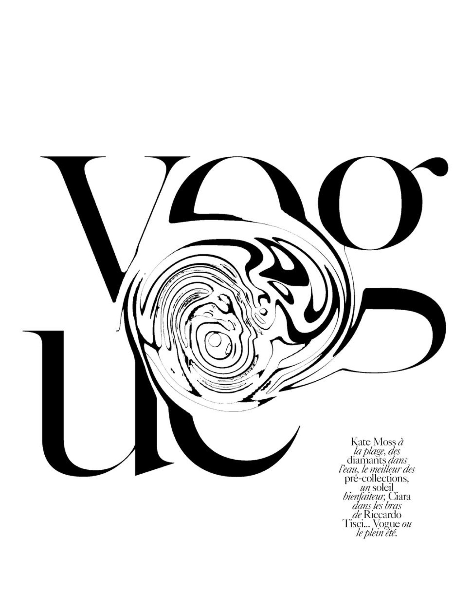
This a page from Vogue Paris and I selected it because of it’s simplicity and boldness. There isn’t much done to the letters, they are plain black and read as they typically do in Vogue, however my swirling even just part of every letter a completely new image is created. I also like that despite the fact that you can’t quite make out that the “E” is an “E” and the other letters are obscured as well, a person is still completely able to tell that this is vogue. A person may have more freedom when it comes to altering something as well known and legendary as Vogue because pretty much no matter what you do to it, people know the name well enough that they will still know it as vogue. I also like that while yes, this is a type of wordmark (kind of), it is strong enough to stand on its own as a graphic as well.


