
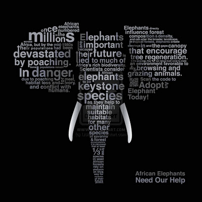
I really like this poster because it uses typography to be informational for a good cause. I think the sans serif typeface was ideal because it makes each word fit its place better. I also think the strategic sizing of different words help to spread more information at first look. It is very clear that the picture is of an elephant. But with ‘elephants’, ‘poaching’, ‘in danger’ and ‘millions’ all written in large letters its very clear what this poster is suggesting that we do. I find this poster to be very creative and effective.


