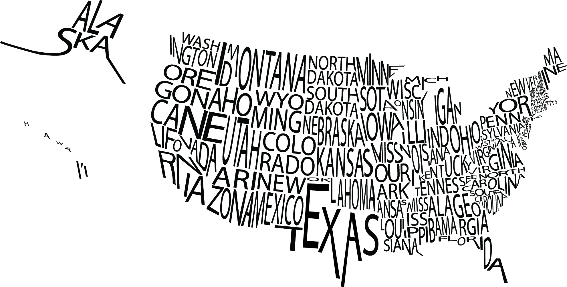
 I was particularly drawn to this image because of the visual image it creates not only with the type, but with the white space as well. The letters in the names of the states are kerned close enough together that the overall image is understood while not making the graphic seemed too squished. If you take the time to actually read each state name, they are all legible which must have proven to be a challenge for the designer.


This image caught my eye because, just as you said, the kerning and sizing of letters is so distinct, yet the words take shape of the state and are still legible. This must have taken hours on hours to accomplish. I particularly enjoy how Hawaii is spread out so that each letter is its own individual island.
This is a really great example of how powerful typography can be. At first, I did not realize that the states were actually composed of their names, which is amazing. The creator of this image really put thought into his design and how he was going to use the typography efficiently and effectively.