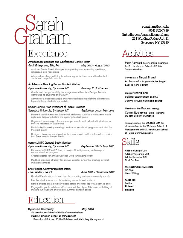
First of, I am immediately drawn to her wordmark which has the letter “G” in it which drops a line down the side of the page creating some balance and direction in digesting the information. With clear, organized headers, it is easy for the reader to navigate through the page to pick up on the key, most important aspects of the resume. i like the way that the experience section dominates the majority of the page, but still includes education, activities, and skills in very clever ways. I also, love the maroon color for the first letter in her first and last names.
This resume’s use of lines is really effective because it leads the eyes across and down the page, depending on the section. I also think it was clever to extend the line from the G in her wordmark. This resume also has a good sense of visual hierarchy, paying special attention to type size and weight. However, I think Sarah might want to try bolding her title within each experience. I think it might create more contrast. Also–small typo: the first “Syracuse University” should be italicized.
Oops in regards to the typo. Thanks for pointing that out! I’ll take care of it in the redo.