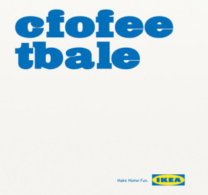
A few years ago, a study came out about being able to read and comprehend jumbled text. Here’s an example from FOX News, too — http://www.foxnews.com/story/2009/03/31/if-can-raed-tihs-msut-be-raelly-smrat/. I thought it was very clever of IKEA to make use of this trend in one of their ads. Along with clearly rearranging the letters, the typeface that they used is very effective. It being large and essentially the only thing on the image is eye-catching and makes people stop and wonder what the ad is about. Also, the slogan that is printed on the bottom, “Make Home Fun” goes along perfectly with the message that their use of typography is conveying.


