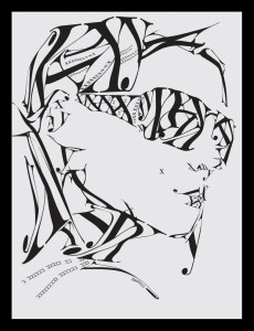
I find this typographic image particularly interesting because it creates an image using primarily three letters: X,Y, and K and one typeface to compose the image. I think the Serif typeface the designer chose really adds a elegant and fashion feel to the design. In order to create this image, the designer used an array of sizes for the letters, stretched the letters, and flipped them. I find the small x on the women’s check particularly interesting. At first I thought it was a mistake, but then I realized the designer used it as a beauty mark. Another interesting aspect of the design is that the girl has no distinct ears, yet because of the placing of the letters it does not detract from the design. The one thing I did not understand was why the designer chose to have a Y coming off the women’s chin because the chin is already defined without it.
GRA 217 Section 5 Group 1
The official blog for GRA 217 with Sherri Taylor


