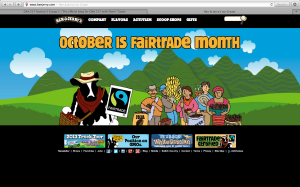
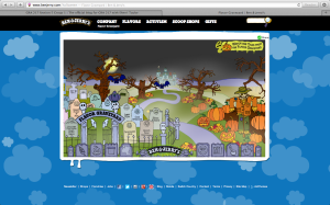
I chose to include three different screen shots because I couldn’t just pick one that represented the whole website. I love this website because it includes so many bright colors but it doesn’t come off as childish or too hectic. Another feature of this website that I like is the interactivity. Almost any image on the page can be clicked. However, these aren’t just simple links to other plain, boring pages. The site almost acts like an online video game. The second screen shot features the “Flavor Graveyard.” Everything on the page moves, from bats flying in the sky to fog floating up from the ground. The user is also able to scroll left and right through the graveyard and click on the tombstones which bring you to a separate page that offers information about the discontinued flavor.
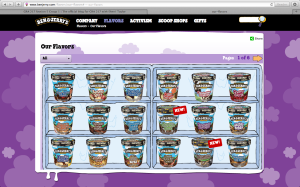
Similarly, the “Our Flavors” page features all of the flavors Ben & Jerry’s currently sells. Instead of just listing the names of these flavors, the flavors are displaying in a freezer in their actual packaging.
And finally, I really appreciate that they update their website regularly. The fact that the homepage says “October is Fairtrade Month” shows that they have updated the website within the last few days and this shows consumers that Ben & Jerry’s is constantly looking to impress, inform and help their consumers.


This website represents the Ben & Jerry’s brand nicely. The bright colors are tied throughout the website, which brings everything together and attracts attention. The colors and animated drawings make the website look almost childish, which works since ice cream is a playful treat. The typeface of the headers is the same typeface used in the Ben & Jerry’s logo. A minimal variety of typefaces ensures that the site doesn’t look overwhelming. I also like how the website is interactive, which creates a fun environment. The cloud background is the same except a different color on every page, which creates separation but makes the website work as a whole.
I don’t want to say I visit Ben & Jerry’s website on a regular basis, but I have done many projects on them and each time I view the website it’s a fun filling experience. It most definitely gives Ben & Jerry’s the image that they want, especially when targeting the younger demographic. I love how they use very vivid colors in all of their illustrations and backgrounds. They incorporate fun cartoons of cows and such to make their website more attractive and exciting. They also use the same typeface throughout the website that is used in their wordmark. Their website is also very easy to navigate. You can find their flavors, their history, or even their foundation within a few clicks of the mouse.